
10 Simple CSS Hover Techniques
How to apply simple and clean hover effects to your website using CSS


Hover effects are very common on every website, it’s what give users the feel that they are interacting with the website they are using.
In this blog we’ll take a look at simple and common hover effects techniques you can implement on your website projects.
INVERT MODE AND TRANSITIONS (BUTTONS):
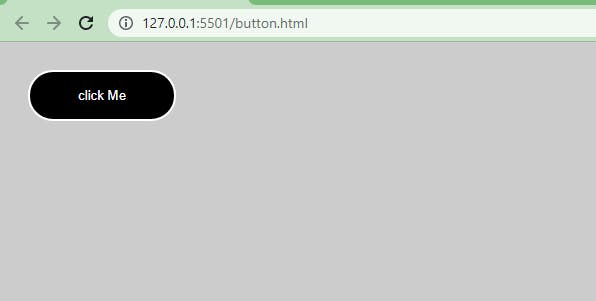
 <main class="wrapper">
    <button class="btn">click Me</button>
  </main>
From the above code example, we have a <button> tag with a class of btn, which is nested inside a <main> tag with a class of wrapper.
body {
    padding: 20px;
    background-color: #ccc;
  }
  .btn {
    border: 2px solid #fff;
    padding: 1rem 3rem;
    border-radius: 3rem;
    cursor: pointer;
    color: white;
    background-color: black;
    transition: all 1s ease-in-out;
  }
  .btn:hover {
    background-color: white;
    color: black;
    /* box-shadow: 3px 3px 2px rgba(0,0,0.7); */
  }
While in our CSS. The body is set to a padding of 20px, a background of light gray (#ccc).
On the btn class we set the button to a border of 2px solid with white color #fff, a padding of 1rem (Top and Bottom ) and 3rem (Left and Right) respectively. We then set the border-radius to 3rem (for rounded corners), cursor to pointer, color to white, background-color to black and transitions to all 1s ease-in-out, while on hover the background-color is set to white and the color is set to black.
Notice how the two color switches as soon as you hover in and out.
Place your mouse pointer over the button to see changes
APPLYING HOVER ON LINKS:
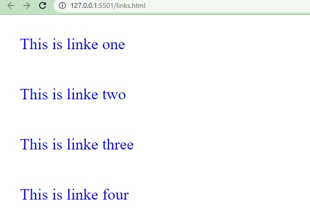
<main class="wrapper">
       <div><a href="#" class="link k1">This is linke one</a></div>
       <div><a href="#" class="link k2">This is linke two</a></div>
       <div><a href="#" class="link k3">This is linke three</a></div>
       <div><a href="#" class="link k4">This is linke four</a></div>
    </main>
From the HTML code above we have five <a> tags nested in a <div> tag which is also nested in a <main> tag whose class is set to wrapper.
Each link tag has a class of links and k1 to k4 respectively.
 div {
        padding: 2em;
    }
   .link {
       font-size: 2em;
       text-decoration: none;
   }
   .k1:hover {
       text-decoration: underline;
   }
   .k2:hover {
       text-decoration: overline;
   }
    .k3:hover {
       color: red;
   }
     .k4:hover {
       background-color: blue;
       color: white;
   }
While on CSS. Each <div> tags take a padding of 2em to separate the tags visually. While the link class is set to a font-size of 2em and text-decoration to none.
Still on the <a> tags, the k1 class is set to text-decoration of underline, k1 text-decoration to overline, k3 color is set to red and on k4 the background-color is set to blue while the color is set to white.
Place your mouse pointer over the text one after the other to see changes.
APPLYING BOX-SHADOW, OUTLINE AND OPACITY
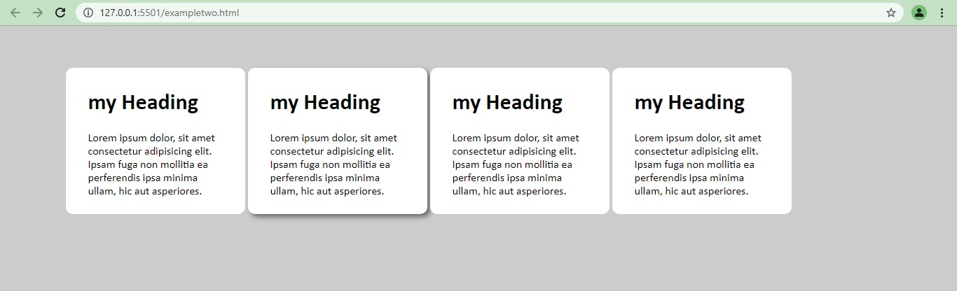
<main class="wrapper">
        <div class="pack">
            <div class="card__one">
                <h1>my Heading</h1>
                  <p>Lorem ipsum dolor, sit amet consectetur
                    adipisicing  elit.
                    Ipsam fuga non mollitia ea perferendis ipsa
                    minima ullam, hic aut asperiores.</p>
            </div>
            <div class="card__two">
                <h1>my Heading</h1>
                <p>Lorem ipsum dolor, sit amet consectetur adipisicing
                             elit. Ipsam fuga non
                       mollitia ea perferendis ipsa minima ullam,
                    hic aut asperiores.</p>
            </div>
            <div class="card__three">
                <h1>my Heading</h1>
                <p>Lorem ipsum dolor, sit amet consectetur adipisicing elit.
                       Ipsam fuga non mollitia ea
                     perferendis ipsaminima ullam,hic aut asperiores.
               </p>
            </div>
            <div class="card__four">
                <h1>my Heading</h1>
                <p>Lorem ipsum dolor, sit amet consectetur adipisicing
                      elit. Ipsam fuga non mollitia ea perferendis ipsaminima
                      uhic aut asperiores.
                </p>
            </div>
        </div>
    </main>
From the HTML code above, we have a <main> tag with a class of wrapper, with a nested <div> tag with a class of pack. Nested inside this tag are four <div> tags with classes of card__one to card__four respectively. Each <div> tags has a <h1> and <p> tag inside it.
body {
        padding: 20px;
        background-color: #ccc;
    }

    .pack {
        width: 90%;
        margin: auto;
        display: grid;
        grid-template-columns: repeat(4, 100px);
        column-gap: 10rem;
    }
    .card__one,
    .card__two,
    .card__three,
    .card__four {
        width: 12rem;
        background-color: white;
        padding: 0.5rem 2rem;
        margin-top: 2rem;
        border-radius: 10px;
        font-family: calibri;
        transition: all 200ms linear;
    }


    .card__one:hover {
        box-shadow: 4px 4px 7px 0 rgba(0, 0, 0, 0.5);
    }
    .card__two {
        box-shadow: 4px 4px 7px 0 rgba(0, 0, 0, 0.5);
    }
    .card__two:hover {
        box-shadow: none;
    }
    .card__three:hover {
    outline: red 3px solid;
    }
    .card__four:hover {
        opacity: 0.5;
    }
While on CSS, we set the body to a padding of 2rem and a background-color of light-gray #ccc. The pack class is set to width of 90%, margin to auto, and display is set to grid with a grid-template-columns of repeat(4, 100px) (this set the pack class to a grid container of four columns grid ) and a column-gap of 10rem.
Next we group our class of card__one to card__four together and we set the width to 12rem, background-color to white, padding of 0.5rem 2rem (top, bottom, left and right, respectively), margin-top 2rem, border-radius 10px (for rounded corners), font-family to Calibri and a transition of “all 200ms (milliseconds) linear”
NOTE: to make the transition faster or slower, reduce or increase the number of the delay (i.e 200ms).
While on hover card__one takes a box-shadow effect, card__two box-shadow is set to none to remove the shadow effect on hover, card__three is set to an outline of 3px color red while card__four is set to opacity of 0.5.
Place your mouse pointer over the cards, one after the other to see changes.
USING CSS FLEX GROW PROPERTY
<main class="wrapper">
        <div class="pack">
            <div class="card__one">
                <h1>my Heading</h1>
                <p>Lorem ipsum dolor, sit amet consectetur adipisicing
                      mollitia ea perferendis ipsa
                      minima ullam, hic aut asperiores.</p>
            </div>
            <div class="card__two">
                <h1>my Heading</h1>
                <p>Lorem ipsum dolor, sit amet consectetur adipisicing
                      elit. Ipsam fuga non mollitia ea perferendis ips
                        minima ullam,hic aut asperiores.</p>
            </div>
            <div class="card__three">
                <h1>my Heading</h1>
                <p>Lorem ipsum dolor, sit amet consectetur adipisicing
                    elit. Ipsam fuga non mollitia ea perferendis ipsa
                    minima ullam, hic aut asperiores.</p>
            </div>
            <div class="card__four">
                <h1>my Heading</h1>
                <p>Lorem ipsum dolor, sit amet consectetur
                    adipisicing elit. Ipsam fuga non mollitia
                        ea perferendis ipsa
                    minima ullam,
                    hic aut asperiores.</p>
            </div>
        </div>
    </main>
While our HTML code remain the same from the previous example, we are going to be using the CSS Flex grow properties to set the tags to grow and shrink on hover
body {
        padding: 20px;
        background-color: #ccc;
    }
    .pack {
        display: flex;
        flex-direction: row;
        justify-content: space-between;
        width: 90%;
        margin: auto;
    }
    .card__one,
    .card__two,
    .card__three,
    .card__four {
        width: 12rem;
        background-color: white;
        padding: 0.5rem 2rem;
        margin-top: 2rem;
        border-radius: 10px;
        font-family: calibri;
        transition: all 200ms ease-in;
    }
    .card__one:hover {
        flex-grow: 0.5;
        background-color: aquamarine;
    }
    .card__two:hover {
        flex-grow: 0.5;
        background-color: rgb(255, 232, 218);
    }
    .card__three:hover {
        flex-grow: 0.5;
        background-color: rgb(153, 177, 255);
    }
    .card__four:hover {
        flex-grow: 0.5;
        background-color: rgb(255, 254, 195);
    }
Firstly, for this effect to work we need to set each card to a flex item, we do this by setting the display property to flex as you can see from the code above, then flex-direction is set to row and a justify-content of space-between.
While on hover each card takes a flex-grow property with a value of 0.5. We also set different colors to each card to visually separate them when you hover over them.
NOTE: to make the transition faster or slower, reduce or increase the number of the delay (i.e 200ms).
Place your mouse pointer over the cards, one after the other to see changes.
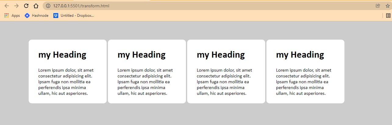
USING CSS TRANSFORM PROPERTIES
Another method we could you to add hover effect to our website is CSS Transform properties. In this section we are going to be using four different types, which include translate, skew, scale and rotate.
  body {
        padding: 20px;
        background-color: #ccc;
    }
    .pack {
        width: 90%;
        margin: auto;
        display: grid;
        grid-template-columns: repeat(4, 100px);
        column-gap: 10rem;
    }
    .card__one,
    .card__two,
    .card__three,
    .card__four {
        width: 12rem;
        background-color: white;
        padding: 0.5rem 2rem;
        margin-top: 2rem;
        border-radius: 10px;
        font-family: calibri;
        transition: all 200ms linear;
    }

    .card__one:hover {
        transform: translate(10px);
    }
    .card__two:hover {
        transform: skew(15deg)
    }
    .card__three:hover {
        transform: scaleY(1.05);
        box-shadow: 4px 4px 7px 0 rgba(0, 0, 0, 0.5);
    }

    .card__four:hover {
        transform: rotate(11deg) scale(1.08);
        box-shadow: 4px 4px 7px 0 rgba(0, 0, 0, 0.5);
    }
In our style sheet the card__one takes transform property with a value of translate(10px), card__two also takes a transform property with a value of skew(15deg) while card__three takes a value of scaleY(1.05) and box-shadow of value 4px 4px 7px 0 rgba(0,0,0,0.5) and card__four we set the transform property value to rotate(11deg) scale(1.08) and a box-shadow of 4px 4px 7px 0 rgba(0,0,0,0.5).
Place your mouse pointer over the cards, one after the other to see changes
CONCLUSION
Alright! We’ve come to the end of this tutorial.
Thanks for taking your time to read this blog post about 10 Simple CSS Hover Techniques for Beginners
Feel free to ask questions. I’ll gladly reply back. You can find me on Twitter and other social media @ocxigin.
#Cheers