

INTRODUCTION:
In this blog, we are going to be looking at how to get started using Tailwind CSS from a complete beginner’s prospective, before you attempt this you should have a basic understanding of HTML and CSS.
TOOLS YOU NEED:
- TEXT EDITOR: You need a text editor, something to write your code on while you learn. The code examples in this blog were written using VS Code but you can use any text Editor of your choice.
- NODE.JS: You should have node.js installed on your computer.
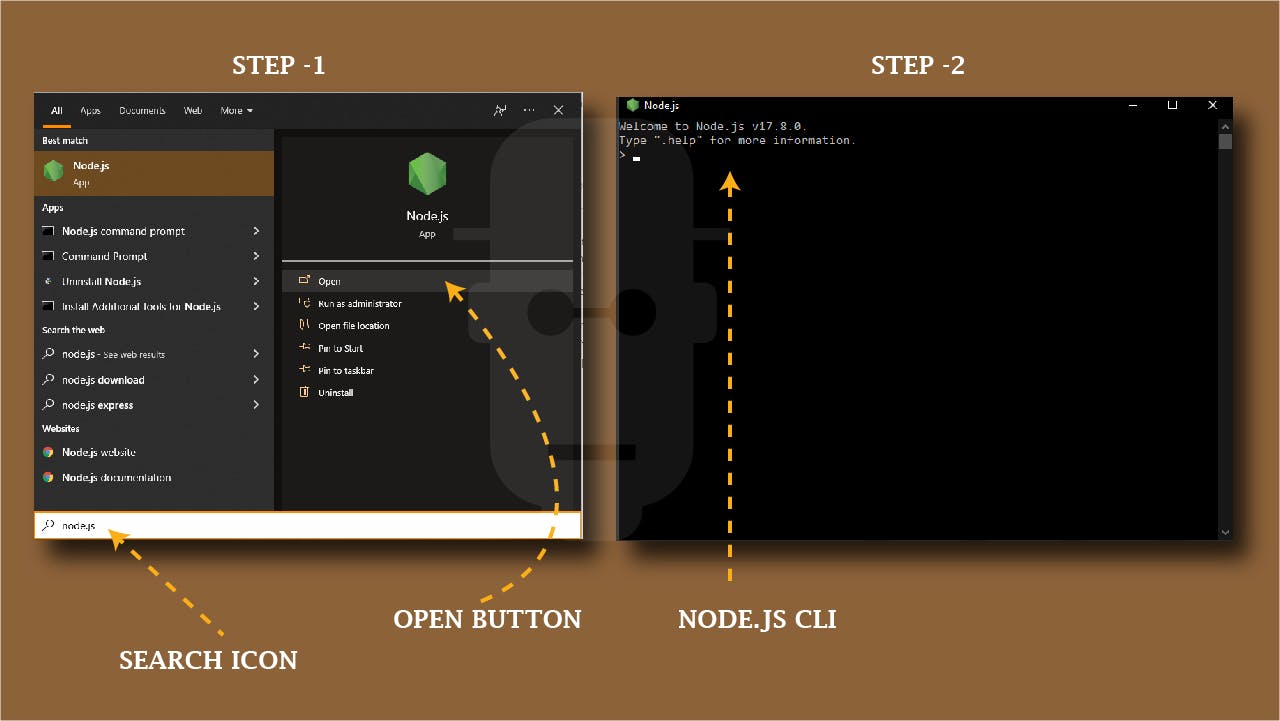 illustration of how to search for installed Node.js with Node.js CLI
To check if your computer already has it installed, type “Node.js” on your windows search icon on task bar, this should pop-up a dialog box, click on “open” button, this should open the node.js CLI. You should see Current Version of the one stalled on your computer.
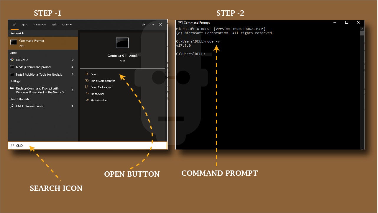 illustration of how to search for installed Node.js with Command Prompt
If this doesn’t work out for you, you can try another method. Go back to the search bar and type “CMD” click on the command prompt “open” button, this should open your command prompt, type “node - -version” or “node -v”. This should display the current version you have installed on your computer. At this time of writing, 17.8.0 is the current version, yours might be higher or lower depending on the version installed on your computer.
If you still can’t find Node.js on your computer, well the next thing to do is to install it.
HOW TO INSTALL NODE.JS
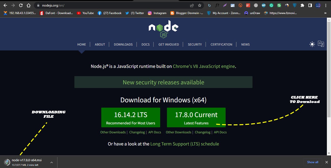
Go to Node.js official website click on the Latest Features button as seen on the website, this should download the node.js installer file.
 Node.js official website.
Wait for it to finishing downloading and then run the downloaded installer pack. This should pop-up the node.js setup wizard dialog box.
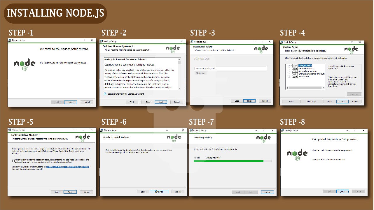 Step by Step Node.js Dialog box of how to install Node.js
- STEP-1: Click next
- STEP-2: Accept the software license Agreement, then click next
- STEP-3: Select the location to install and click next
- STEP-4: Also from the custom setup, click next
- STEP-5: Click Next for tools for native modules.
- STEP-6: Click Install to start the installation process and wait for it to finish installing
- STEP-7: Click Finish.
Now Node.js has finally been installed on your computer. To confirm this use the instruction explained above.
WHAT IS TAILWIND CSS
Tailwind CSS is a CSS Framework with a pre-built low level utility classes for Rapid building of modern websites without ever leaving your HTML. Utility in this sense refers to pre-defined CSS class(es) that are created to do just one specific thing when applied to an HTML element. For Example, the Tailwind CSS pre-define class of pt-1 apply a style rule of padding-top: 0.25rem; which is 4px. It’s as simple as that.
Unlike other CSS Frameworks Tailwind CSS does not provide you with a pre-define template or impose a design pattern to follow but utility classes which gives you the freedom to create your website UI the way you want it and also things like media queries has already been created for you and categorize into breakpoints so you don’t have to create it yourself, all you have to do is use the utility class(es) for the specific breakpoints your working on.
SETTING UP TAILWIND CSS
There are different methods to include Tailwind CSS to your project and start using. We’ll be looking on just two methods which are using a Play CDN and Installing Tailwind CSS on your computer Using Tailwind CLI for local development
PLAY CDN:
According to Tailwind CSS Official Documentation. The Play CDN is designed for development purposes only, and is not the best choice for production.
Now lets see how we can include the play CDN in our project. Firstly lets create a folder called “file” and inside this folder lets create an HTML file called “index.html”
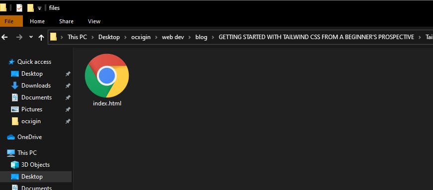 Screenshot of a HTML File
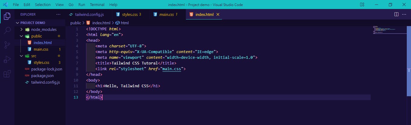
now drag and drop this file to your preferred text Editor, in our case we’ll use VS-Code.
 Screenshot of VS-Code
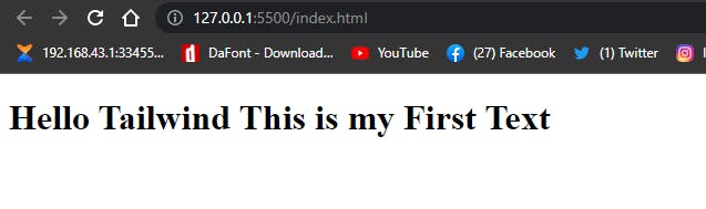
Lets create our first Hello, Tailwind Text.
<h1>Hello Tailwind This is my First Text</h1>
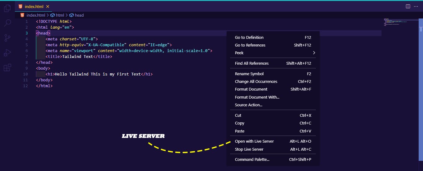
Now run your HTML file in your browser, since we use VS-Code, We’ll be using live server to run our code on the browser, as seen below.
 Screenshot of VS-Code running on live server
Your code should looks like this on your browser.
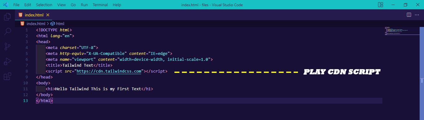
Now that we’ve seen how a plane HTML file looks like, lets add the Tailwind CSS Play CDN Script to our Project.
<script src="https://cdn.tailwindcss.com"></script>
To do this we have to copy the play CDN script and paste it to the head section of our HTML file as seen below.
 screenshot of VS-Code with TailwindCSS Play CND Script
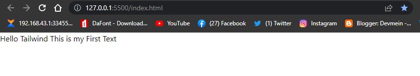
After you have successfully copy and paste the play CDN Script. Save and refresh your browser.
Notice how the <h1> heading style effect changes to a <p> style effect.
Tailwind by default removes the styling of heading, padding and margins in our HTML document, giving us the freedom to style it the way we want with Tailwind Utility Classes.
Your Code output should look like this.
 screenshot of Hello world in Tailwindcss
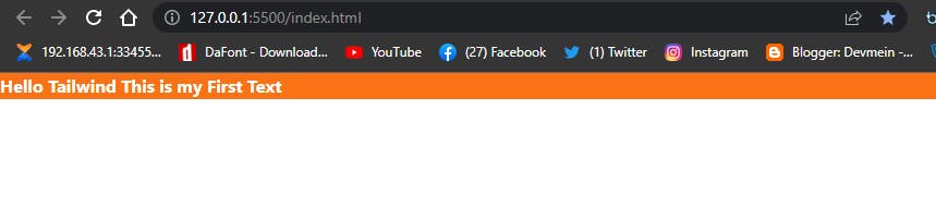
Now that we’ve got TailwindCSS set-up and We printed our first text on the screen, lets make it a little bit fancy, by adding some background-color, text color and font weight.
Write the code below and run on your browser.
<h1 class="bg-orange-500 text-white font-bold">Hello Tailwind This is my First Text</h1>
Your code output should look like this.
 screenshot of browser output of Tailwind CSS Tutorial
This might not look as fancy as you would expect but its a good place to start.
IMPORTANT NOTICE: For the purpose of clarity and understanding try not to copy and paste code, try typing them into your Text Editor as this helps you to memorize the code and syntax. Also if
you don’t understand a particular section, code, syntax or topic continue reading or read other materials online. With continuous practice everything will make sense.
TAILWIND CLI
We’ve talked about using Play CDN now we going to be installing Tailwind CSS via NPM which is a Node Package Manager.
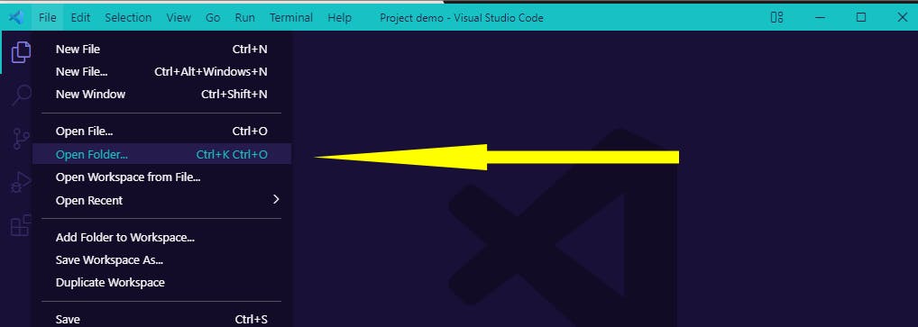
- STEP 1: Create a Folder on your Desktop and name it “Project demo”.
 Create a file on Desktop
STEP 2: Lunch your preferred Text Editor, in this case, we are using VS Code.
STEP 3: Navigate to “File” click on “Open Folder”.
 Screenshot How to open folder in VS Code
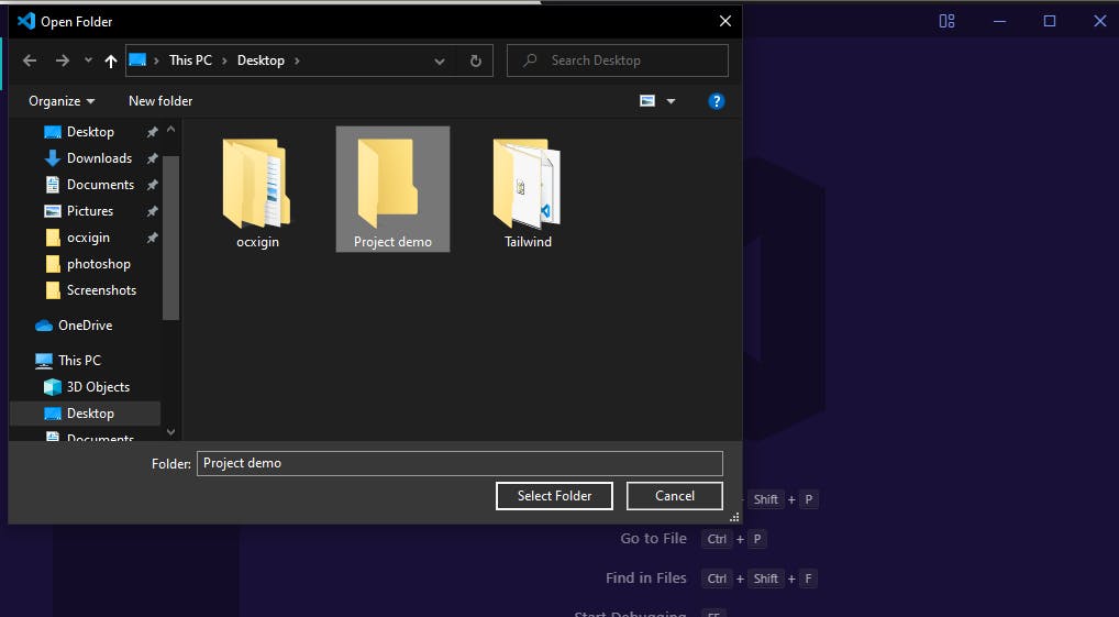
STEP 4: From the Dialog Box Select your “Folder” and click the “Select Folder” button. This Should open up your folder on VS Code.
 screenshot of how to open a folder in VS code
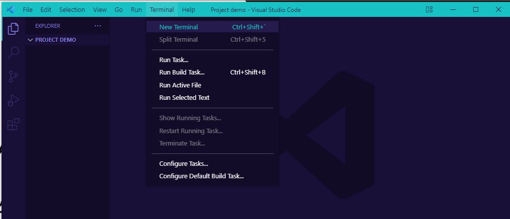
STEP 5: Now that you have your folder opened, go to Terminal and click New Terminal.
 screenshot of how to lunch terminal in vs code.
STEP 6: Your Terminal should open at the button of your VS Code.
Now that we have our terminal setup, we are going to download Tailwind CSS via NPM.
 Screenshot of Terminal opened in VS code.
- STEP 7: Copy and paste the command on your Terminal in VS Code. Then hit enter, this will create a
tailwind.config.jsfile.
after you’ve done that, your tailwind.config.js file will start downloading immediately wait for it to finished downloading.npm install -D tailwindcss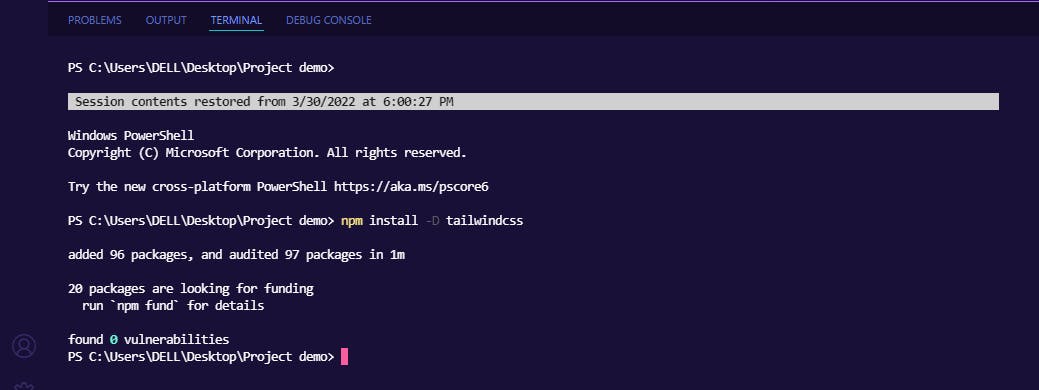 screenshot of Tailwind CSS config file download.
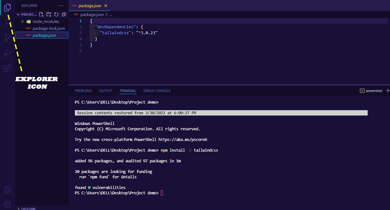
Once download is finished, navigate to Explorer icon on VS Code, you should see we have a folder named node-modules, this folder as the name imply contains all the necessary node modules Tailwind CSS need to function properly, don’t touch this file. The next two are files named package-lock.json and package.json file. Click on the package.json file to open, you should see the version of Tailwind we have installed, at the time of writing we are currently working with Version 3.0.23.
- STEP 8: The next thing to do is copy and paste the second command, then hit enter.
This will create another file called tailwind.config.js file. (This will appear directly below the package.json file in our VS Code Explorer.)npx tailwindcss init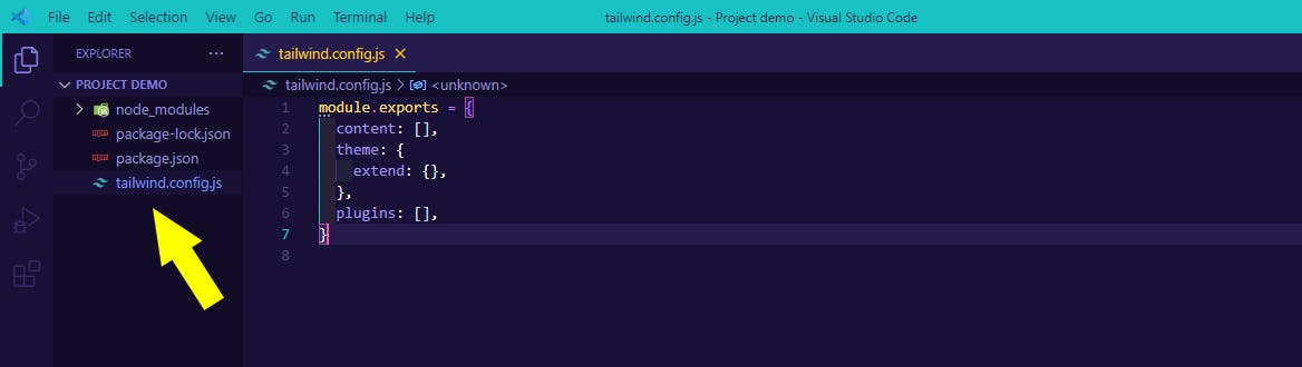 screenshot of Tailwind CSS config.js file
"./src/**/*.{html,js}"
Now click the tailwind.config.js file to open. copy and paste the above path inside the square bracket of the content keyword and change the src to public as indicated below
module.exports = {
  content: ["./public/**/*.{html,js}"],
  theme: {
    extend: {},
  },
  plugins: [],
}
now click save.
- STEP 9: Create a new folder and name it “src” and inside this folder create a file and name it
styles.css, then click to open it, now copy and paste the Tailwind directives to your to yourstyles.cssfile as shown below.
@tailwind base;
@tailwind components;
@tailwind utilities;
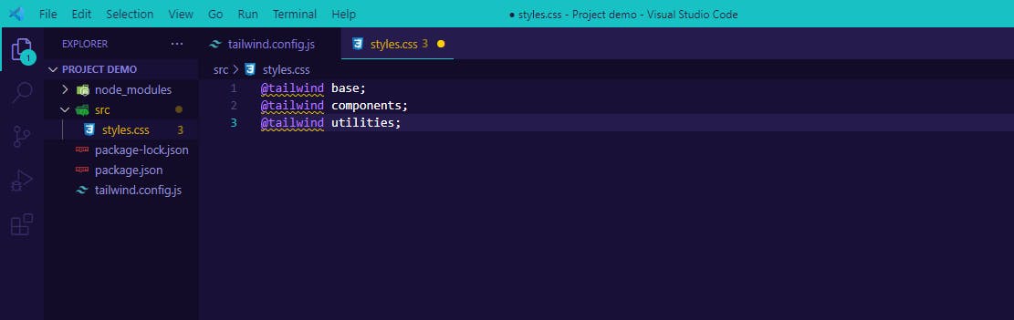 screenshot of Tailwind CSS directives
After pasting save.
STEP 10: We are going Start the Tailwind CLI build process to scan your template files for classes and build your CSS.
If you read from the Tailwindcss docs, the code below is what we are given
npx tailwindcss -i ./src/input.css -o ./dist/output.css --watch
What we have to do is rename input.css path to styles.css to match the styles.css file we created earlier in our src folder. And then the dist/output.css will be rename to public/main.css, as shown below.
npx tailwindcss -i ./src/styles.css -o ./public/main.css --watch
IMPORTANT NOTICE: You can name the path anything you want but while you do so, make sure you understand what you are doing.
STEP 11: Now copy and paste the second command we edited on our Terminal. And then hit enter
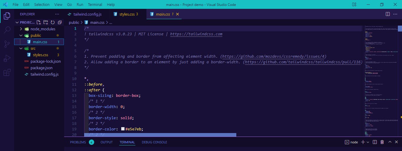 screenshot of the new public folder and main.css file created
Next thing to do is to create our first Hello, Tailwind text.
<!DOCTYPE html>
<html lang="en">
<head>
    <meta charset="UTF-8">
    <meta http-equiv="X-UA-Compatible" content="IE=edge">
    <meta name="viewport" content="width=device-width, initial-scale=1.0">
    <title>Tailwind CSS Tutoral</title>
    <link rel="stylesheet" href="main.css">
</head>
<body>
    <h1>Hello, Tailwind CSS</h1>
</body>
</html>
now run it on your browser, we’ll use Live Server since we are using VS Code. Your code should look like this.
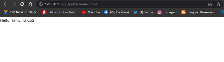 screenshot of hello Tailwind CSS text
Now that we have seen how to setup TailwindCLI and also print our first Hello, Tailwind text on the screen, let’s learn how to work with the Tailwind CSS Utility Classes.
TAILWIND CSS INTELLISENSE (VS CODE EXTENSION)
Before we begin writing our Tailwind Classes, We should understanding that VS Code might not understand some of the Tailwind Classes which happen to be written right inside our HTML file, Some VS Code Intellisense might highlight some of our code as errors whereas they are just Tailwind Classes, so to solve this we have to install an Extension called “Tailwind CSS Intellisence”. It will help in proper syntax highlighting for easy debugging, auto-complete, hover previews and linting etc.
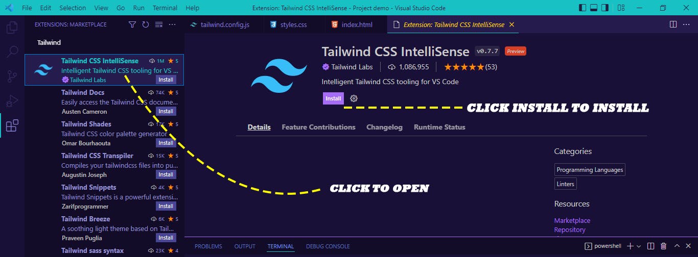 How to install Tailwind CSs IntelliSense in VS Code
To install click on the VS Code Extension Icon and search for Tailwind css intellisense, when this appears click on it to open and click on thee install button. This Should install Tailwind CSS Intellisense.
TAILWIND BASIC UTILITY CLASSES:
In this section we are going to be learning how to work with Tailwind CSS Utility Classes.
TYPOGRAPHY:
By default Tailwind CSS provide us with basically three font family utilities which we can apply to our project such as sans-serif, serif and monospace. Note that this fonts mentioned here are not one font in particular, for example serif fonts refers to family of fonts which includes; Georgia, Cambria, "Times New Roman” etc.
Lets see how to apply this fonts to our project.
<!DOCTYPE html>
<html lang="en">
<head>
    <meta charset="UTF-8">
    <meta http-equiv="X-UA-Compatible" content="IE=edge">
    <meta name="viewport" content="width=device-width, initial-scale=1.0">
    <title>Tailwind CSS Tutorial Example</title>
    <script src="https://cdn.tailwindcss.com"></script>
</head>
<body>
    <h1>This is a heading text</h1>
    <div>This is our first div</div>
    <div>this is our second div</div>
    <div>This is our third div</div>
</body>
</html>
from the code above, your code should look like this when you run it on your browser.
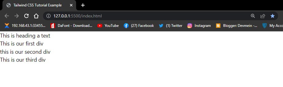 screenshot of a plan text display in Tailwind CSS
Now lets add the three Tailwind CSS Utility fonts to each of the three
screenshot of a plan text display in Tailwind CSS
Now lets add the three Tailwind CSS Utility fonts to each of the three <div> tags available on our HTML file.
<h1>This is heading a text</h1>

    <div class="font-sans">This is our first div</div>
    <div class="font-serif">this is our second div</div>
    <div class="font-mono">This is our third div</div>
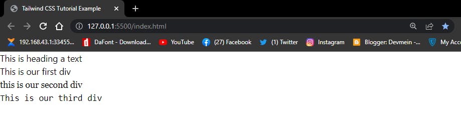 screenshot of text with Tailwind CSS font Utility Classes
Notice how the text have change from the individual <div> tags. There so much to TailwindCSS than just changing fonts, we can also apply, font size, font style, font weight etc.
-FONT-SIZE: To increase or decrease the font-size of a particular font
<h1>This is heading a text</h1>

    <div class="font-sans text-sm">This is our first div</div>
    <div class="font-serif text-lg">this is our second div</div>
    <div class="font-mono text-3xl">This is our third div</div>
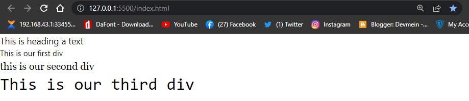
-FONT-STYLE: We can change how our font look by applying an ‘italic’ to change the style and ‘not-italic’ to make it appear normal.
<h1>This is heading a text</h1>

    <div class="font-sans text-sm">This is our first div</div>
    <div class="font-serif text-lg not-italic">this is our second div</div>
    <div class="font-mono text-3xl italic">This is our third div</div>
 screenshot of a plan text in Tailwind CSS
Notice from our second <div> tag that nothing change but the third <div> tag have an italic effect applied.
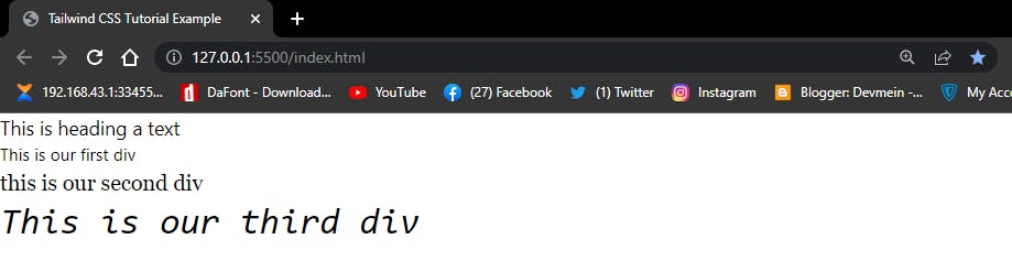
-FONT-WEIGHT: To increase or decrease the weight of a text.
<h1>This is heading a text</h1>

    <div class="font-sans text-sm font-black">This is our first div</div>
    <div class="font-serif text-lg not-italicn font-bold">this is our second div</div>
    <div class="font-mono text-3xl italic font-light">This is our third div</div>
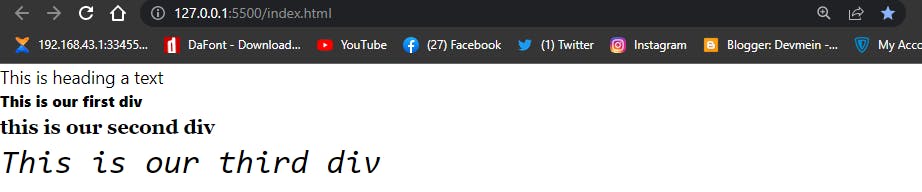
screenshot of text with font-weight in Tailwind CSS
Notice the boldness of our first and second <div> tag.
- LINE-SPACING: Line spacing enable us to add spaces between each word of a paragraph. The Tailwind CSS utility for this is
tracking
<h1>This is heading a text</h1>

    <div class="font-bold tracking-widest">This is our first div</div>
    <div class="font-bold tracking-wider">this is our second div</div>
    <div class="font-bold tacking-tigher">This is our third div</div>
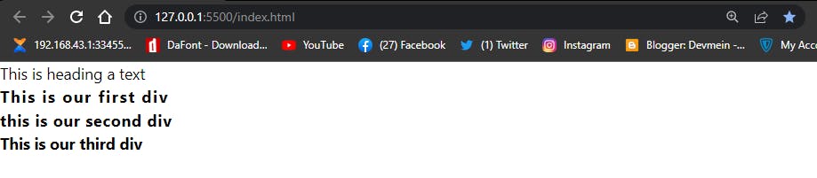 screenshot of line spacing known as tracking in Tailwind CSS
-LINE HEIGHT: Line height enable us to add space above a paragraph. The Tailwind CSS utility for this is leading.
<h1>This is heading a text</h1>

    <div class="font-bold">This is our first div</div>
    <div class="font-bold">this is our second div</div>
    <div class="font-bold leading-10">This is our third div</div>
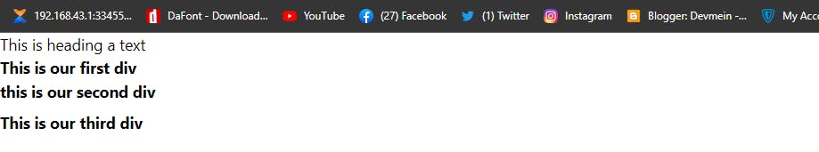 screenshot of line-height in Tailwind CSS refer to as leading.
-LIST STYLE TYPE: This is used to add bullet and numbering, and also for removing them when necessary.
<body class="ml-12 mt-4">

    <h1>This is List Style Type Example</h1>

    <div class="list-disc mt-6">
        <li>This is list one</li>
    </div>

    <div class="list-decimal">
        <li>This is list two</li>
    </div>

    <div class="list-none">
        <li>This is list three</li>
    </div>
</body>
Your Code should look like this
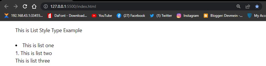 screenshot of list style type in Tailwind CSS
Notice the last <li> tag doesn't have any bullet or numbering attached to it, this is because we set it to list-none .
From our HTML code above you we notice the presence of ml-12 and mt-4 . This are margin-left and margin-top respectively. We apply them to push the content away from the edge of the browser. We will explain margin in the coming section.
- TEXT ALIGN: Text Align enable us to set how our element should be align across the browser. We can align our text to left, right, center and even justify them so that our text are well adjusted from both left and right hand sides.
By default browsers align text to the left, so when you set your text to text-left you will end up not getting any result since the text is already align to the left. The best time to apply this utility class is when you want to re-align a text that is not align to the left.
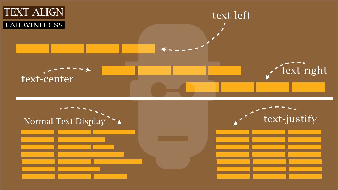 illustration of text align in Tailwind CSS
Type the HTML code below and run on your browser
<body class="ml-12 mt-4 mr-12">

    <h1>This is heading a text</h1>

    <div class="text-center">This is our first div</div>
    <div class="text-right">this is our second div</div>
    <div class="text-left">This is our third div</div>

    <div class="text-justify pt-4">Lorem ipsum dolor sit amet consectetur
                adipisicing elit. Nihil sed laborum assumenda? Necessitatibus quisquam
                laudantium, sed possimus placeat quam explicabo mollitia blanditiis natus
                ea quis maiores iure velit aut, ducimus quaerat iusto cum alias voluptates sit!
                Officiis nobis obcaecati quae unde commodi aperiam optio harum est assumenda,
                recusandae, officia tempora.
    </div>

</body>
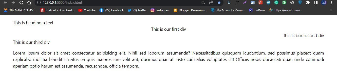 screenshot of text align in Tailwind CSS
- TEXT COLOR: Text color enable us set the color of our choice. In Tailwind CSS the utility class for this is a text followed by the name of the color and numbers ranging from 100 to 900 which is use to set the intensity of shade of the same color. For example to change the text color from the default black color to blue, we simply type
text-blue-100this will give us a very light shade of blue color, we can increase the intensity by picking a higher number, that is something like 500 or 600. Note; the further we move toward 900 the darker the shade of blue.
Type and run the code below on your browser
<body class="ml-12 mt-4 mr-12">

    <div class="text-4xl text-blue-100">This is blue with 100 shade</div>
    <div class="text-4xl text-blue-200">This is blue with 200 shade</div>
    <div class="text-4xl text-blue-300">This is blue with 300 shade</div>
    <div class="text-4xl text-blue-400">This is blue with 400 shade</div>
    <div class="text-4xl text-blue-500">This is blue with 500 shade</div>
    <div class="text-4xl text-blue-600">This is blue with 600 shade</div>
    <div class="text-4xl text-blue-700">This is blue with 700 shade</div>
    <div class="text-4xl text-blue-800">This is blue with 800 shade</div>
    <div class="text-4xl text-blue-900">This is blue with 900 shade</div>

</body>
Browser out put
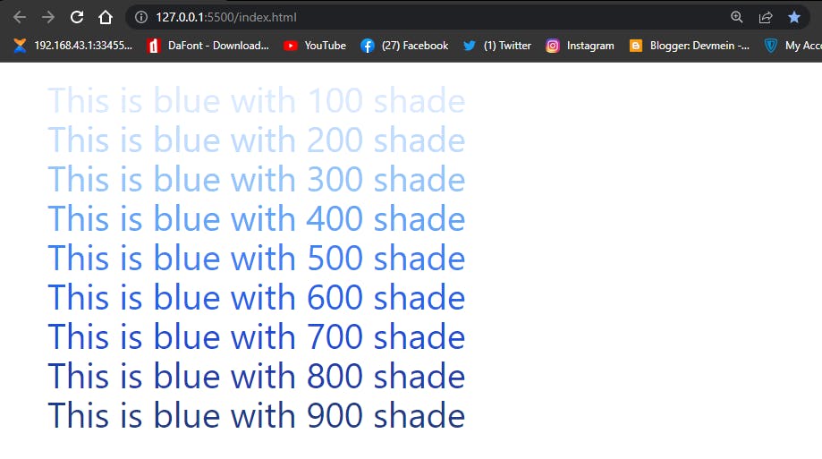 Tailwind CSS text color from 100 to 900 shade of blue
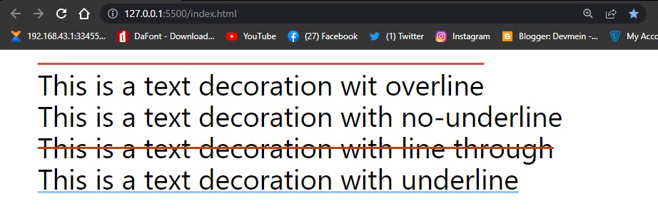
- TEXT DECORTION: Text decoration enable us to add some style to our text with the use of lines, which includes:
underline,overline,line-throughand we can useno-underlineto remove any of the text decoration styles.
Type and run the code below.
<body class="ml-12 mt-6 mr-12">

    <div class="text-4xl overline">This is a text decoration wit overline</div>
    <div class="text-4xl no-underline">This is a text decoration with no-underline</div>
    <div class="text-4xl line-through">This is a text decoration with line through</div>
    <div class="text-4xl underline">This is a text decoration with underline</div>

</body>
browser output
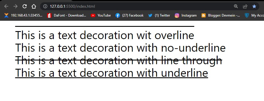 screenshot of Tailwind CSS with Text Decoration Styles
- TEXT DECORATION COLOR: Just as the name sounds, we use text decoration color to add colors to our text decorations styles.
Type and run the code below.
<body class="ml-12 mt-6 mr-12">

    <div class="text-4xl overline decoration-red-500">This is a text decoration wit overline</div>
    <div class="text-4xl no-underline">This is a text decoration with no-underline</div>
    <div class="text-4xl line-through decoration-orange-700">This is a text decoration with line through</div>
    <div class="text-4xl underline decoration-blue-300">This is a text decoration with underline</div>

</body>
Browser output
 screenshot of text decoration color in Tailwind CSS
-TEXT DECORATION STYLE: With text decoration styles, we can add styles to our lines which will determine how the lines appear. In Tailwind CSS there are basically five styles we could use. This includes, solid, dotted, dashed, wavy, and double
<body class="ml-12 mt-6 mr-12">

    <div class="text-4xl overline decoration-red-500 decoration-solid with solid style">This is a text decoration with solid</div>

    <div class="text-4xl underline decoration-double">This is a text decoration with with double style</div>

    <div class="text-4xl underline decoration-orange-700 decoration-dotted">This is a text decoration with dotted style</div>

    <div class="text-4xl underline decoration-blue-300 decoration-dashed">This is a text decoration with dashed style</div>

    <div class="text-4xl underline decoration-blue-300 decoration-wavy">This is a text decoration with wavy style</div>

</body>
Browser output
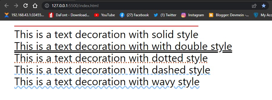 screenshot of Tailwind CSS text decoration styles
-TEXT DECORATION THICKNESS: We can increase and decrease the text decoration thickness. The code below shows us how to do it.
<body class="ml-12 mt-6 mr-12">

<div class="text-4xl underline decoration-auto">This is a Tailwind CSS Text Decoration Example</div>

<div class="text-4xl underline decoration-from-front">This is a Tailwind CSS Text Decoration Example</div>

<div class="text-4xl underline decoration-8">This is a Tailwind CSS Text Decoration Example</div>

<div class="text-4xl underline decoration-4">This is a Tailwind CSS Text Decoration Example</div>

<div class="text-4xl underline decoration-0">This is a Tailwind CSS Text Decoration Example</div>
Browser output
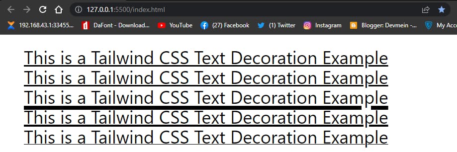 Screenshot of text decoration thickness in Tailwind CSS
-TEXT UNDERLINE OFFSET: With text underline offset we can add a little bit of white space between the text and the underline style. The code below shows us how to do it.
<body class="ml-12 mt-6 mr-12">

<div class="text-4xl underline ">This is a Tailwind CSS Text Decoration Example</div>

<div class="text-4xl underline underline-offset-8">This is a Tailwind CSS Text Decoration Example</div>

<div class="text-4xl underline underline-offset-4 pt-8">This is a Tailwind CSS Text Decoration Example</div>

</body>
Browser output
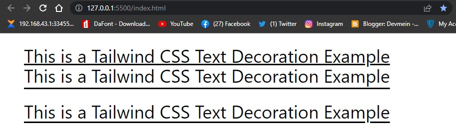 How to apply text decoration offset in Tailwind CSS
-TEXT TRANSFORM: Text Transform enable to transform text character to either uppercase, lowercase or sentence case. In Tailwind CSS the utility class for these are, uppercase, lowercase and capitalize. Capitalize utility class is quite different from the first two, while uppercase it used to transform all text character from small letters to capital letters and lowercase is used to transform all capital letters to small letters. Capitalize is used to transform only the first letter of a sentence to Capital letter while the normal-case utility class is used to transform text character to it normal state. For example our last <div> tag have is set to text transform to uppercase but when we hover over it, it return back to lowercase . The code below explain how to do it.
<body class="ml-12 mt-6 mr-12">

    <div class="text-4xl mt-4 uppercase">This is how to text Transform in Tailwnd CSS</div>

    <div class="text-4xl mt-4 lowercase">THIS IS HOW TO TEXT TRANSFORM IN TAILWIND CSS</div>

    <div class="text-4xl mt-4 capitalize">this is how to text Transform in Tailwnd CSS</div>

    <div class="text-4xl mt-4 uppercase hover:normal-case">This is how to text Transform in Tailwnd CSS</div>

</body>
Brower output. (hover on the last element to see how it changes in action)
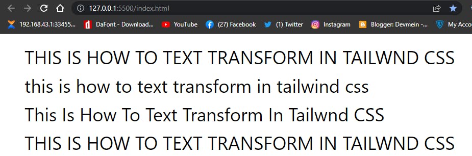 how to add text transform in Tailwind CSS
-TEXT INDENT: Text indent enable us to add the amount of space needed before the beginning of a sentence in a block element. The code below explain how to do it.
<body class="ml-12 mt-6 mr-12">
    <div class="text-4xl indent-12">Lorem ipsum dolor, sit amet consectetur adipisicing elit. Iusto deleniti, qui modi tempora dolorem eos repellendus similique harum,
        aliquid voluptatem adipisci
         enim? Illo blanditiis facere consectetur reiciendis sed dicta quibusdam incidunt ipsum tempore dolore labore iste delectus unde natus beatae similique magni dolorem velit reprehenderit,
         exercitationem
         laboriosam. Voluptate,
          natus eius!
</div>
</body>
Browser output
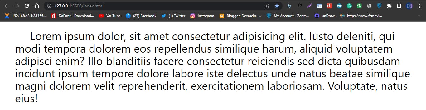 Text indent in Tailwind CSS
SIZING:
Width and Height are very important properties in CSS, in Tailwind there are special utility class designed for you to use. The best place to see all the utility classes for width, height, min-width, min-height, max-width and max-height is the Official Tailwind Docs, everything have been listed out for you. The code below shows you how to use sizing in Tailwind CSS.
<body class="ml-12 mt-6 mr-12">

    <div>
        <div class="w-28 h-28 bg-red-500"></div>
    </div>

</body>
Browser Output
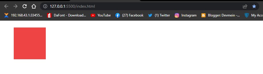 How to use width and height in Tailwind CSS
From the code above you will notice that w-28 (w-28 is 7 rem which is equal to 112px in vanilla CSS) and h-28 is used to represent width and height respectively. The w and h stands for width and height and then followed by an hyphen and then a numeric value. This value represent the amount of pixels you want to assign to a specific element. There are times when we want to assign a width:auto to an element we use w-auto in Tailwind while percentages, we use w-1/2 to set the percentage and w-full is used to represent 100%
For better understand see the illustrated chart below.
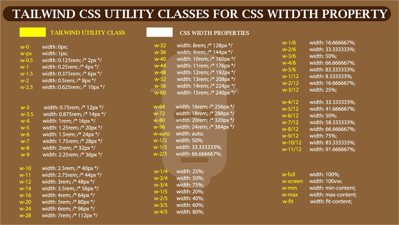 Illustration of Tailwind CSS Utility classes for CSS width property
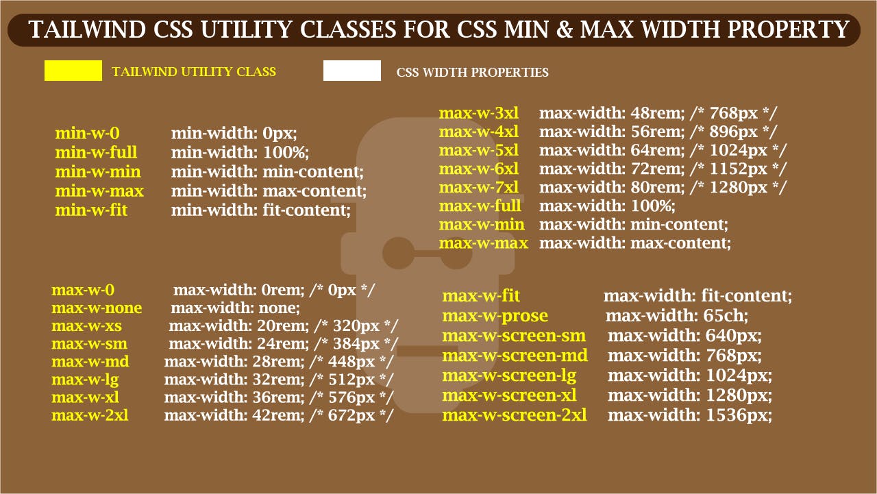 Illustration of Tailwind CSS Utility Class for CSS Min & Max width property
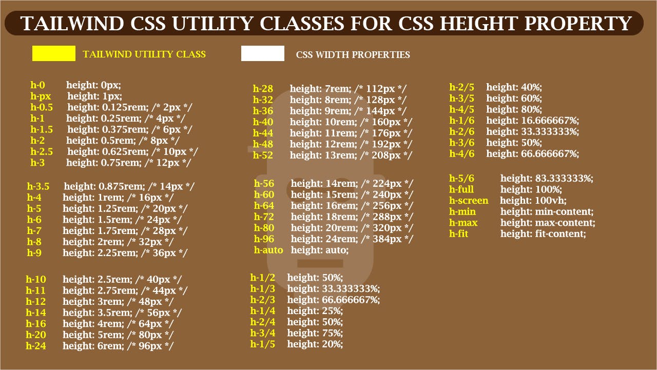 Illustration of Tailwind CSS Utility classes for CSS Height Property
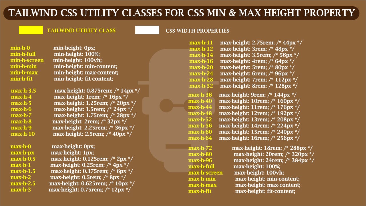 Illustration of Tailwind CSS Utility Classes for CSS min & max height property
The above illustration serves as template you could use while developing with Tailwind CSS. Now lets look at some other code examples on how to use sizing in Tailwind CSS.
<body>

    <div>
        <div class="w-1/2 h-24 bg-blue-500"></div>
    </div>

    <div>
        <div class="w-screen h-24 bg-orange-500"></div>
    </div>

    <div>
        <div class="w-4/5 h-8 bg-black"></div>
    </div>

    <div>
        <div class="w-full h-24 bg-purple-800"></div>
    </div>

</body>
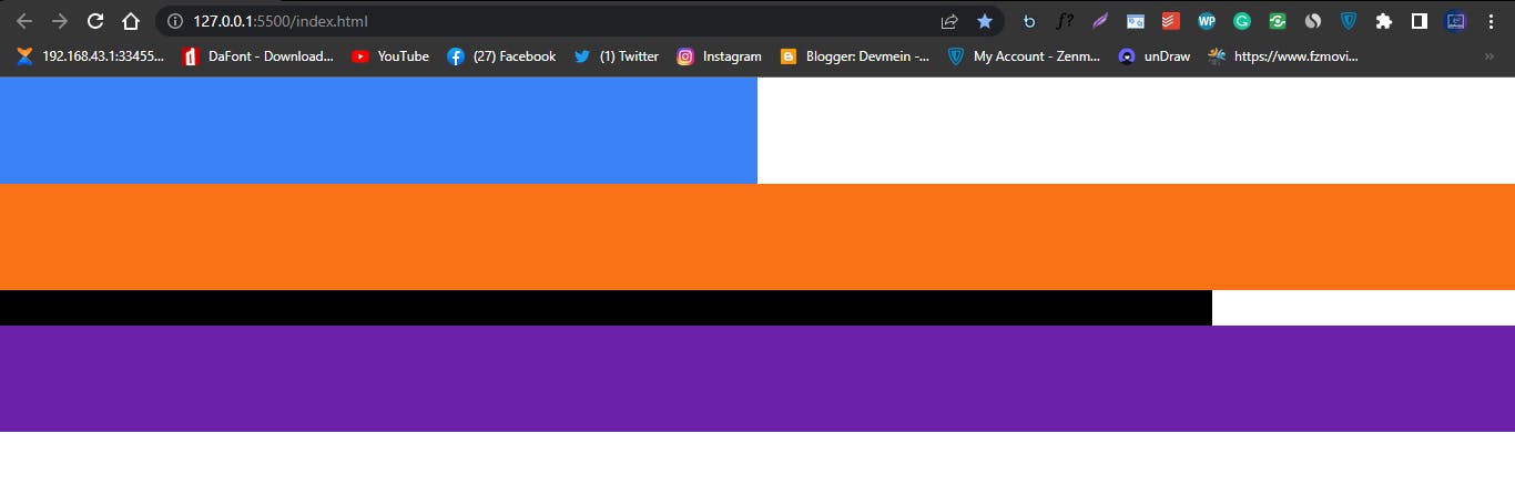
How to use sizing in Tailwind CSS
From the HTML code above, our first <div> tag is assign a utility class of w-1/2 which is 50% in Vanilla CSS and a height of 96px which is h-24 in Tailwind CSS.
The second <div> tag is assign a w-screen which in CSS is viewport width, this tag also have a background color of orange and from our browser preview you will see that the orange box occupy the entire with area of the browser without any space left on both left and right.
The third <div> tag does a very basic thing, it has a width of w-4/5 which is 80% in Vanilla CSS and a background color of black.
The fourth <div> is assign a w-full which is 100% in vanilla CSS. From our browser preview you’ll notice that just like the second <div> tag the element covers the entire width leaving no space on both left and right just like the second <div> tag.
Should incase you are wondering if w-screen and w-full are the same thing, the right answer is NO! this is because w-screen refers to the browser viewport width while w-full refers to 100% of the containing parent element of a particular tag.
USING ARBITRARY VALUE:
Trying to memorize Tailwind CSS Utility classes can be very frustrating especially when you are just starting out using the framework. It can even be more frustrating when working with sizing utility classes such as width and height . Ever now and then you have to go back and forth to confirm what w-4/5 or p-4 means in Tailwind CSS, until you get familiar with these classes this might be an issue for you to deal with.
The good news is there is a work around to fix this in Tailwind. With Arbitrary Values you can apply custom values that are not present in pre-defined Tailwind utility classes.
The code below show you how it works.
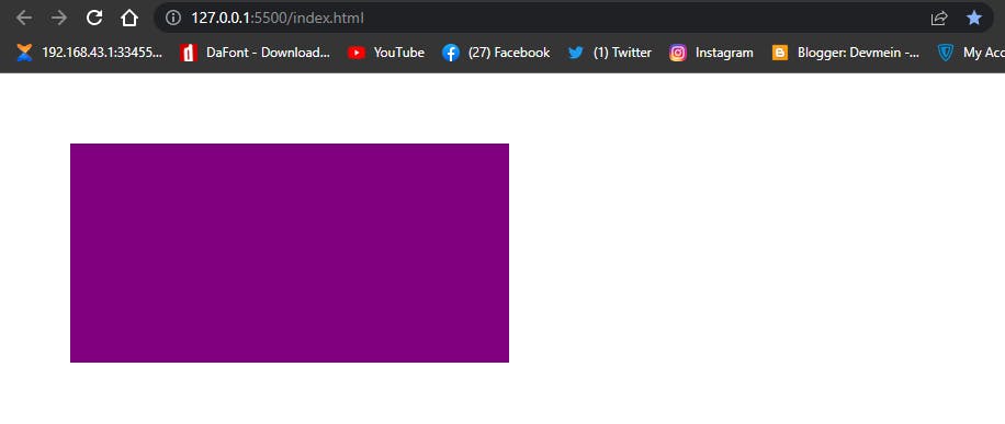
<div class="ml-[12px] mt-[8px]">
       <div class="w-[300px] h-[200px] bg-blue-800 rounded"></div>
   </div>

    <div class="pl-[2rem] pt-[2em]">
        <div class="w-[12rem] h-[8rem] bg-[#ffcc00]"></div>
    </div>
Browser output
 How to use arbitrary values in Tailwind CSS
When working with arbitrary values you have to use the bracket notation as seen in the code example above, you include the values with the unit inside the bracket. This same method is also used when working with Arbitrary Properties.
ARBITRARY PROPERTIES:
Just like arbitrary values, arbitrary properties does exactly the same thing but instead its used for adding custom properties that are not included in Tailwind pre-made utility classes.
The code below shows us how its done.
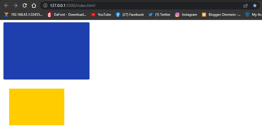
<div class="[margin-left:4em] [margin-top:4em]">
        <div class="[width:400px] [height:200px] [background-color:purple]"></div>
 </div>
Browser output
 How to use arbitrary properties in Tailwind CSS
NOTE: The Arbitrary Values or Arbitrary Properties is not built to replace the use of pre-defined classes such as w-4/5 , p-4 or rounded instead it’s a way of adding custom values when the need arises.
SPACING:
padding and margin are very common methods used to add spaces between elements in CSS. The Tailwind CSS utility classes for these are p and m whereas to assign a values to these letters we first have to add an hyphen followed by an attached numeric values which is also part of the utility classes of padding and margin.
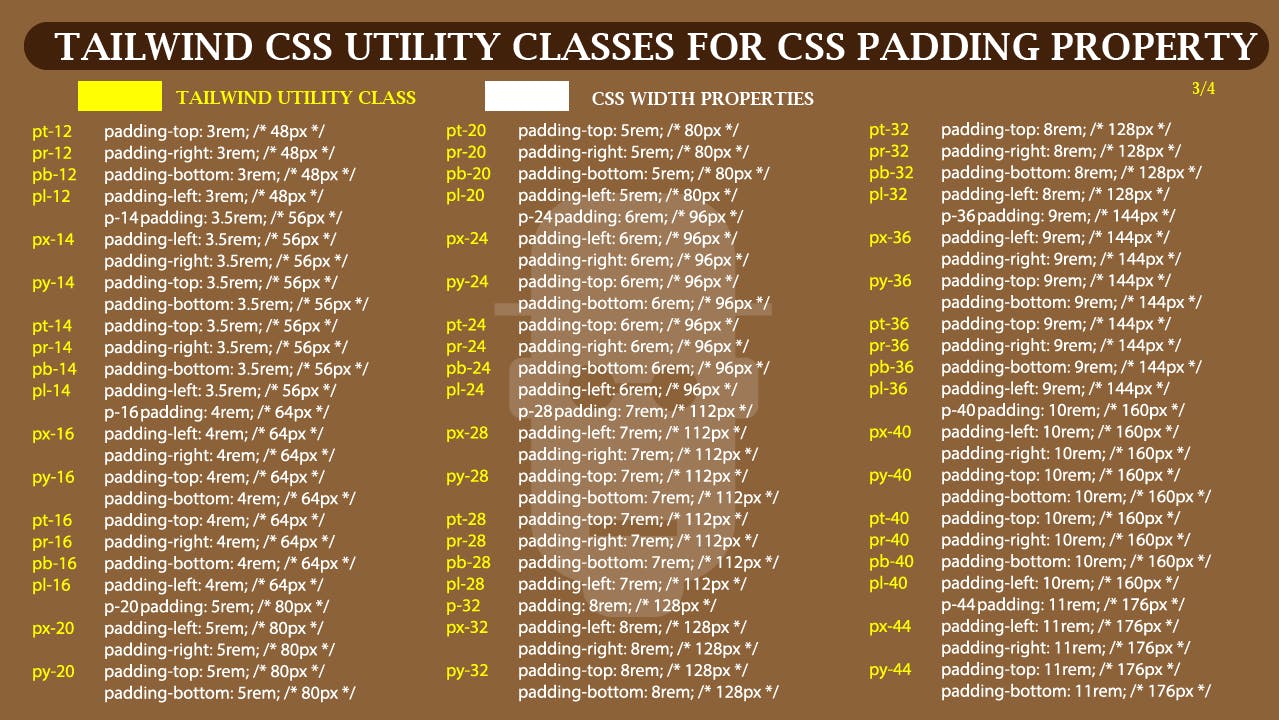
-PADDING: To target the four corners of an element with padding, Tailwind CSS provide us with different approaches by splitting padding utility classes into different part where pl is padding-left , pt is padding-top, pr is padding-right , pb is padding-bottom , py is padding-top and padding-bottom, used to target both top and bottom padding while px is used to target both padding-left and padding-right.
See the padding cheat sheet for better understanding
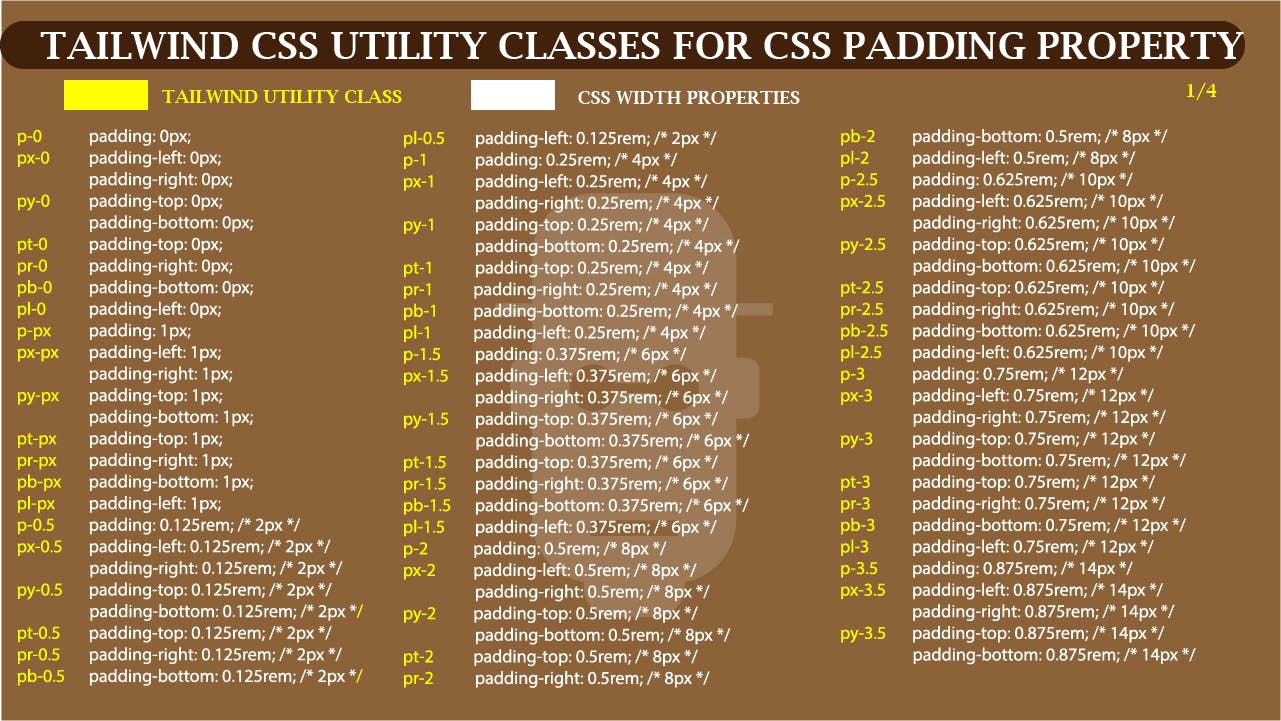 cheat sheet for Tailwind CSS Utility classes for padding (1 of 4)
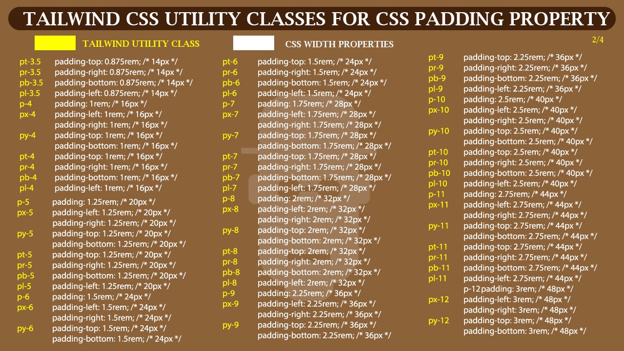 cheat sheet for Tailwind CSS Utility classes for padding (2 of 4)
 cheat sheet for Tailwind CSS Utility classes for padding (3 of 4)
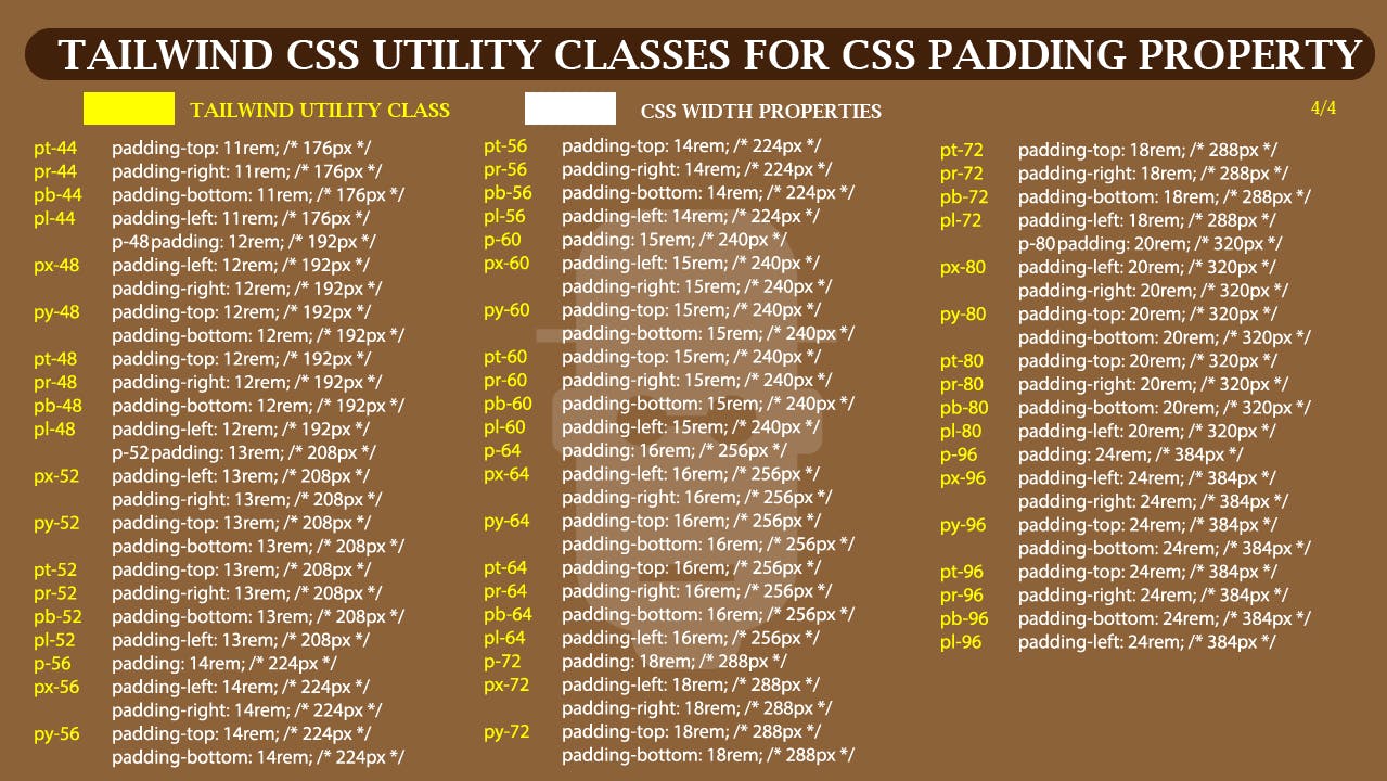 cheat sheet for Tailwind CSS Utility classes for padding (4 of 4)
- MARGIN: Just like
padding, the same method is applicable here whereasmlismargin-left,mtismargin-top,mrismargin-right,mbismargin-bottom,myismargin-topandpadding-bottom, used to target both top and bottom margin whilemxis used to target bothmargin-leftandmargin-right.
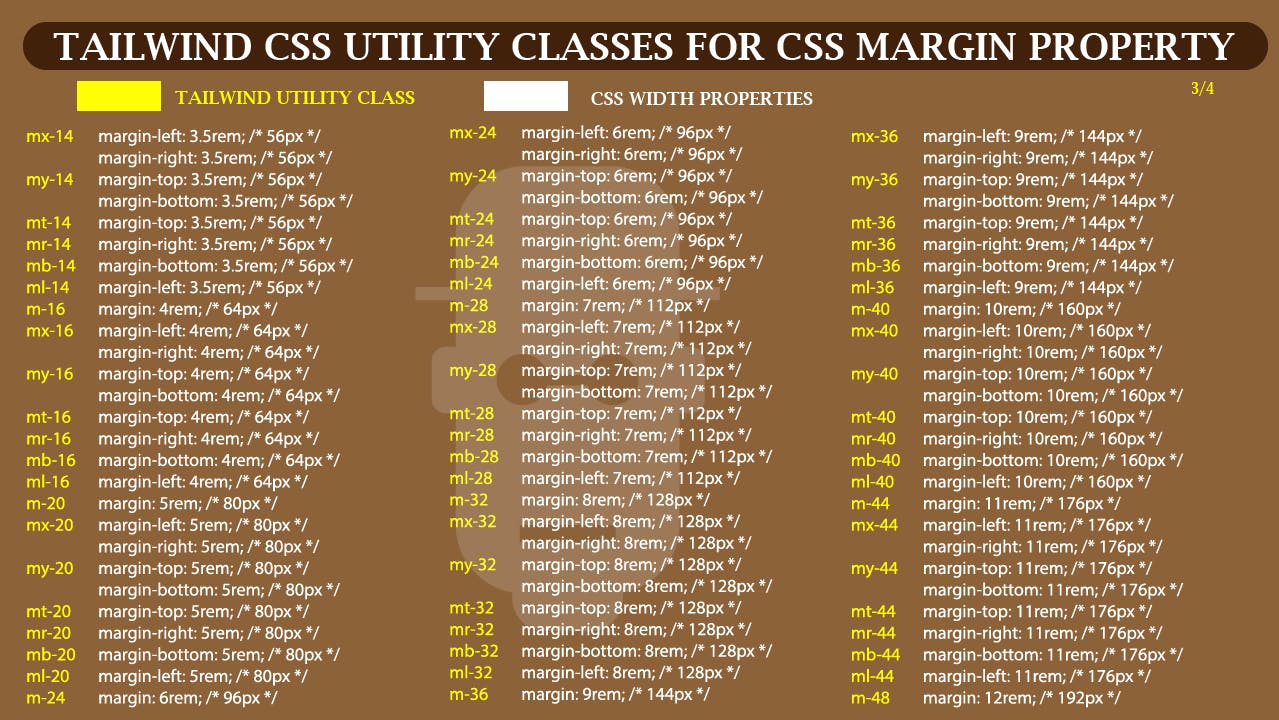
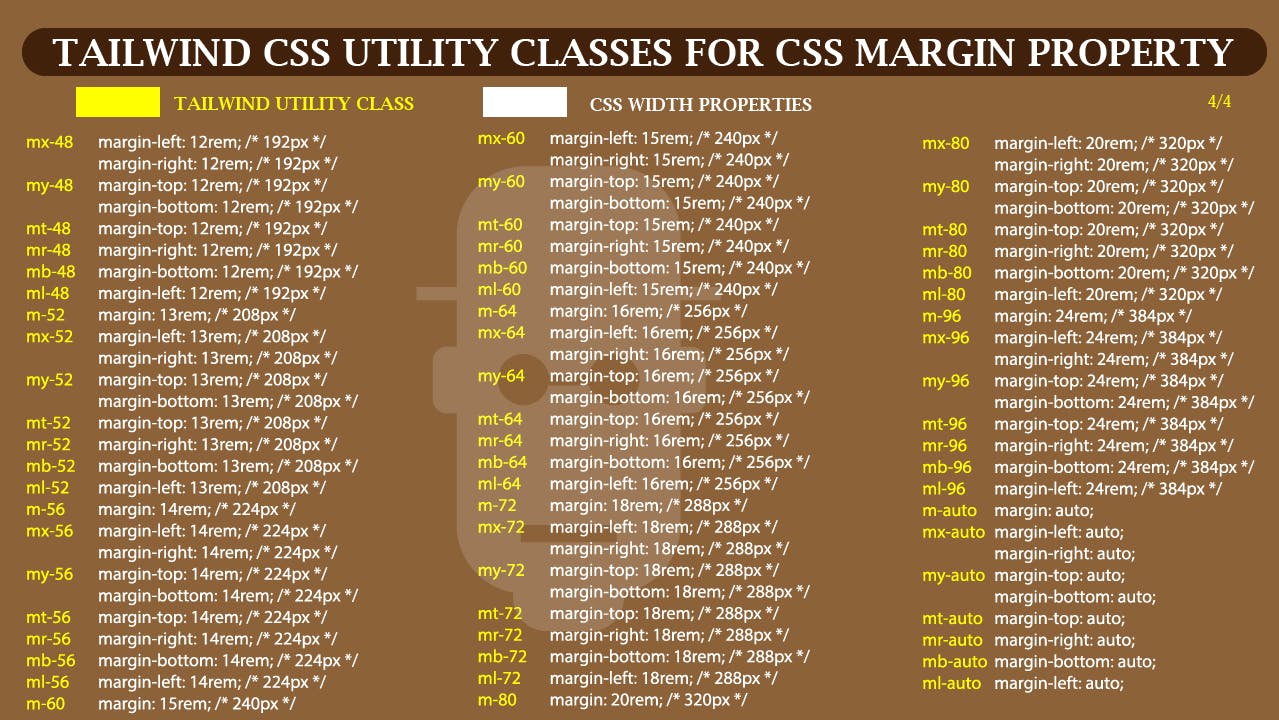
See the margin cheat sheet for better understanding.
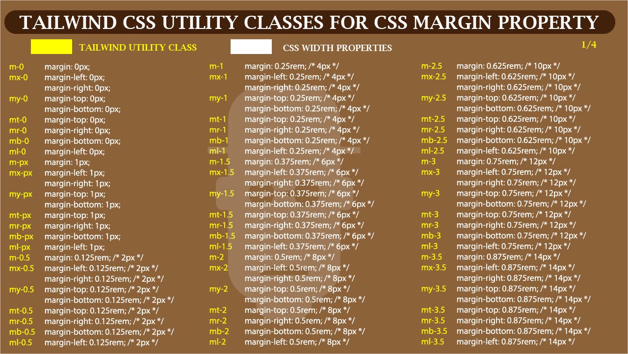 cheat sheet for Tailwind CSS Utility classes for margin (1 of 4)
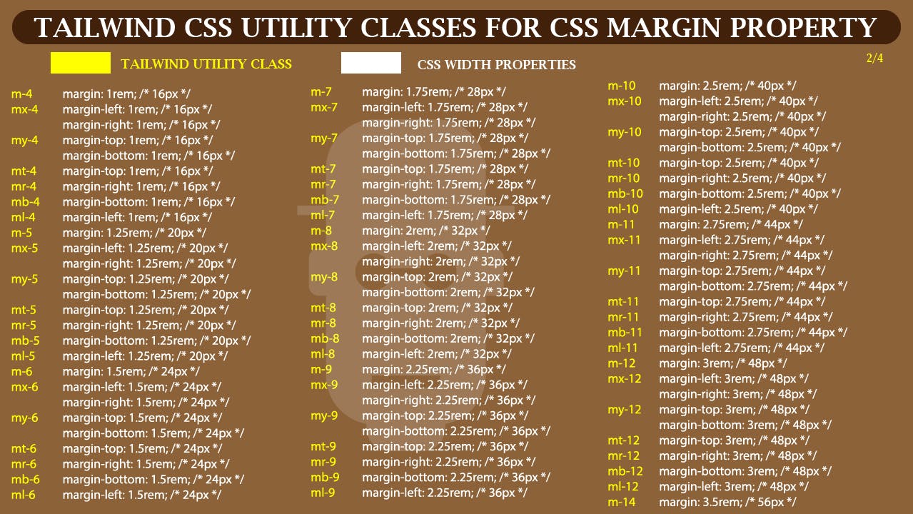 cheat sheet for Tailwind CSS Utility classes for margin (2 of 4)
 cheat sheet for Tailwind CSS Utility classes for margin (3 of 4)
 cheat sheet for Tailwind CSS Utility classes for margin (4 of 4)
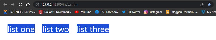
To see how padding and margin works with the code below.
<div>
        <div class="mt-8 ml-8 text-4xl text-white ">
            <div class="bg-blue-700">list one</div>
            <div class="bg-blue-700 mt-8">list two</div>
            <div class="bg-blue-700 mt-8">list three</div>
        </div>
    </div>

    <div class="mt-8 ml-8">
        <button class="bg-blue-700 text-white rounded-full py-2 px-4 hover:bg-green-700">Click Me!</button>
    </div>
Browser output
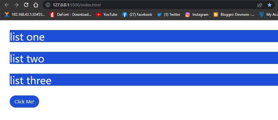 How to use padding and margin in Tailwind CSS
From the above code we use mt-8 (margin of 32px) to add space to left and top margin of our element and another mt-8 to the top of our <div> tags to separate them.
Furthermore we create a <button> white a text of Click Me!. We added a padding of top and bottom of py-2 which is 8px and px-4 for left and right padding which is 16px.
-SPACE BETWEEN: The space between utility in Tailwind enable us to add spaces between child elements.
Below is simple cheat sheet for you to follow.
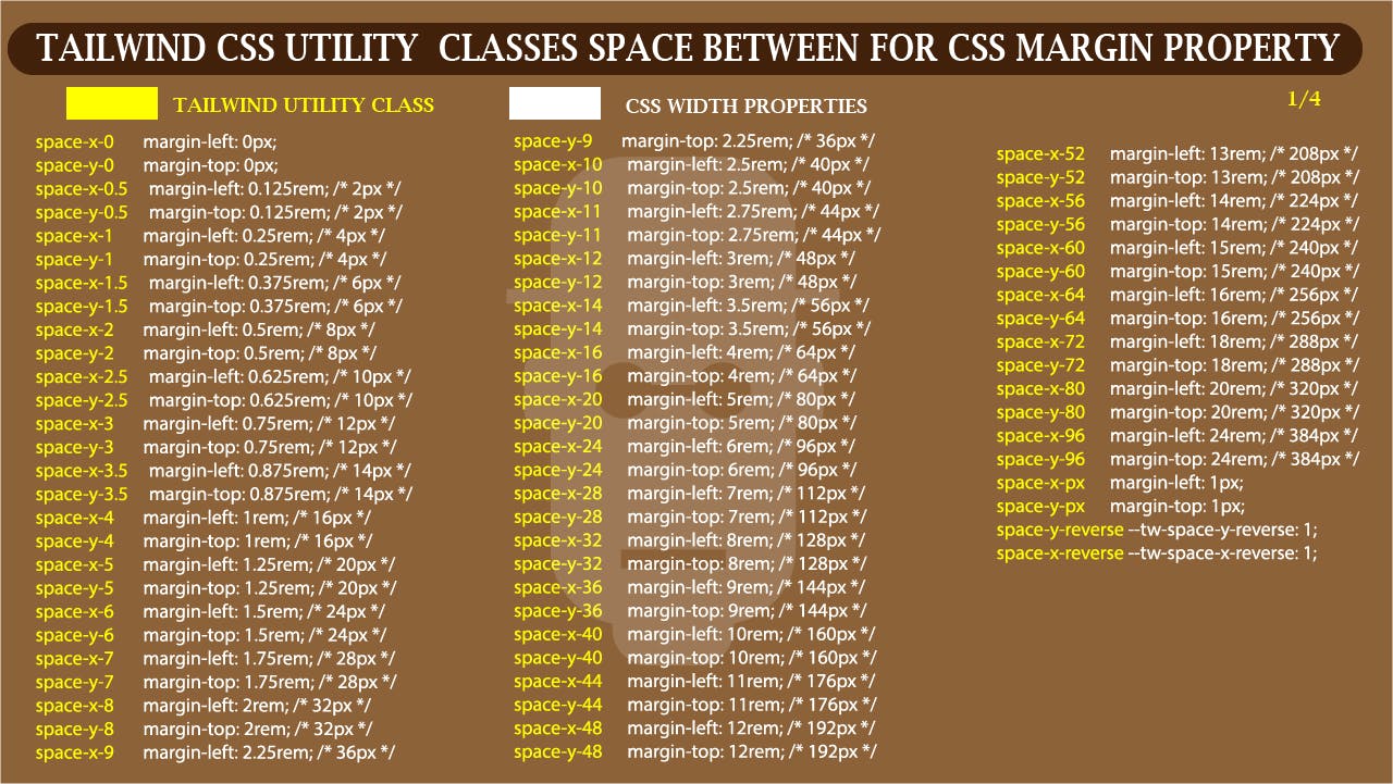 Space Between Cheat Sheet in Tailwind CSS.
To make this work, this utility class will have to be declared on the parent element which will directly the children.
Lets see how we can make this work with code.
<div>
        <div class="mt-8 ml-8 flex text-4xl text-white space-x-8">
            <div class="bg-blue-700">list one</div>
            <div class="bg-blue-700">list two</div>
            <div class="bg-blue-700">list three</div>
        </div>
</div>
Browser output
 Space between in Tailwind CSS
FLEX:
Except you are new to CSS. Flexbox is not something new. Tailwind CSS provides us with basic utility classes we can use in our project. The examples below shows you are to get started.
- FLEX: The
flexutility class in Tailwind set our parent container to a flex-container, just like in traditional CSS.
Type and run the code below on your browser.
<div>
      <div class="mt-8 ml-8 text-4xl text-white">
            <div class="bg-green-700">Box one</div>
            <div class="bg-purple-500">Box two</div>
            <div class="bg-pink-700">Box three</div>
       </div>
    </div>
Browser output.
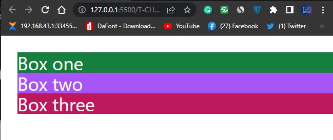 Screenshot of flexbox in Tailwind CSS
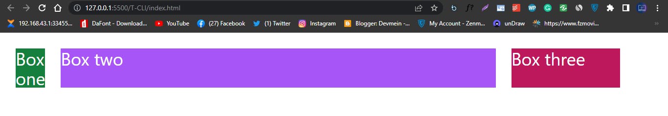
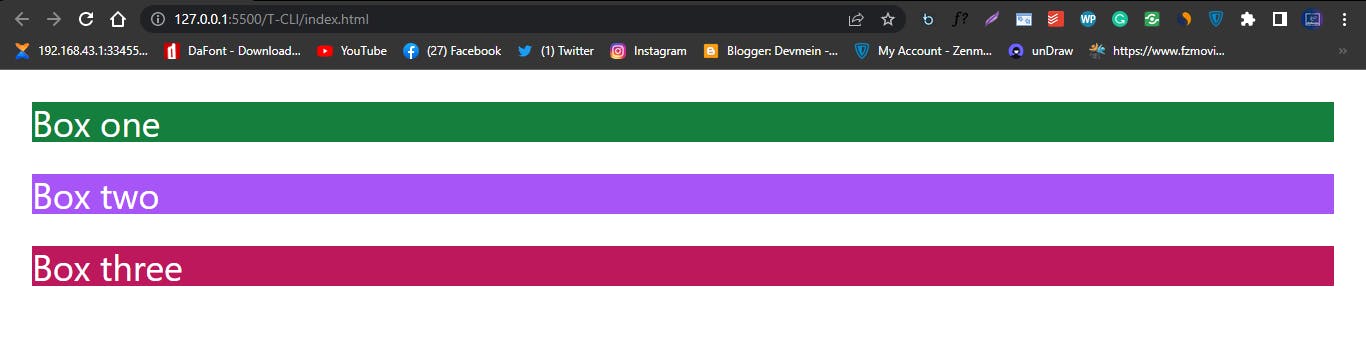
From the above examples, we have <div> tags with a text content of Box one, Box two and Box three. Which are stacked on top one another, without CSS styles HTML Elements are stacked top to bottom but when we apply the CSS flexbox property of display: flex;, we can convert it from the normal ordering of top to bottom to display left to right. In Tailwind the utility class for this is flex . See the code example below.
<div>
        <div class="flex space-x-8 mt-8 ml-8 text-4xl text-white">
            <div class="bg-green-700">Box one</div>
            <div class="bg-purple-500">Box two</div>
            <div class="bg-pink-700">Box three</div>
        </div>
    </div>
Browser output
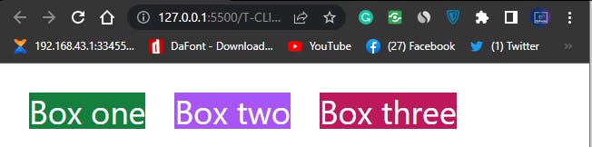 screenshot of flexbox in tailwind CSS
After we added the flex utility class, we also added another Tailwind utility class of space-x-8 to add margins to the flex items of the flex container.
FLEX-BASIS:
Continuing from where we stoped. The flex-basic is used to control the initial length of flex-items. This property only works when the parent element is a flex container, that is the parent element has display: flex; set to it.
For the Tailwind CSS utility class for flex-basis, see the illustrated flex-basis cheat-sheet.
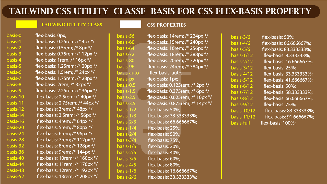 Flex-basis cheat-sheet utility class in Tailwind CSS
Type and run the code in your browser
<div>
        <div class="flex space-x-8 mt-8 ml-8 text-4xl text-white">
            <div class="bg-green-700 basis-4">Box one</div>
            <div class="bg-purple-500 basis-4/6">Box two</div>
            <div class="bg-pink-700 basis-1/6">Box three</div>
        </div>
    </div>
Browser output
 flex-basis in Tailwind CSS
We added a flex-basis of basis-4 which is 1rem, basis-4/6 which is 66.666667% and basis-1/6 which is 16.666667% . For a comprehensive understanding of TailwindCSS utility classes for flex-basis,
study the flex-basis cheat-sheet above.
FLEX DIRECTION:
The flex-direction property is used to control the direction of a flex-item within a flex container. The Tailwind utility classes for flex direction are in four categories.
See the illustrated cheat sheet below.
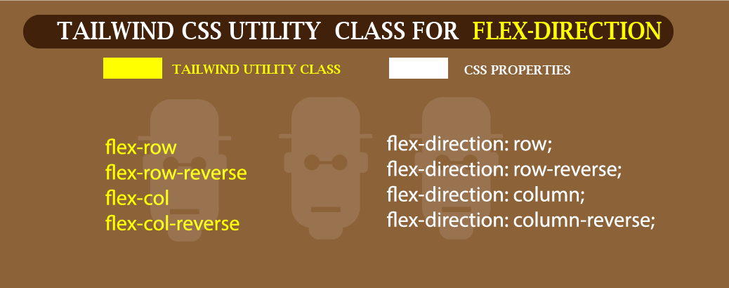 Lets see how this is done, using the code below.
<div>
        <div class="flex flex-col space-y-8 mt-8 ml-8 mr-8 text-4xl text-white">
            <div class="bg-green-700 basis-4">Box one</div>
            <div class="bg-purple-500 basis-4/6">Box two</div>
            <div class="bg-pink-700 basis-1/6">Box three</div>
        </div>
    </div>
Browser output
 Screenshot of flex-direction column in Tailwind CSS.
From the above code we use flex-col which convert the flex-direction from row to column. We also change the space-x-8 to space-y-8 to add margin to the flex-items on the y-axis and a mr-8 is also added to a margin-right with the flex-container.
for more on flexbox property check the Tailwind CSS official doc.
GRID:
The CSS grid which is a two dimensional is also supported in Tailwind CSS. Just like how we have to display: grid; in Native CSS, all we have to do in Tailwind CSS is just type the utility class of grid . This will help convert our parent element to a grid container.
- GRID TEMPLATE COLUMNS: For better understanding see the grid-template columns cheat-sheet.
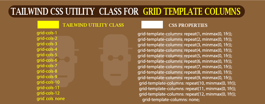 Tailwind CSS Cheat-Sheet for grid-template columns.
Type and run the code on your browser
<div>
        <div class="mt-8 ml-8 mr-8 text-4xl text-white">
            <div class="bg-blue-200">Grid one</div>
            <div class="bg-blue-300">Grid two</div>
            <div class="bg-blue-500">Grid three</div>
            <div class="bg-blue-700">Grid four</div>
            <div class="bg-blue-900">Grid five</div>
            <div class="bg-black">Grid six</div>
        </div>
    </div>
Browser output
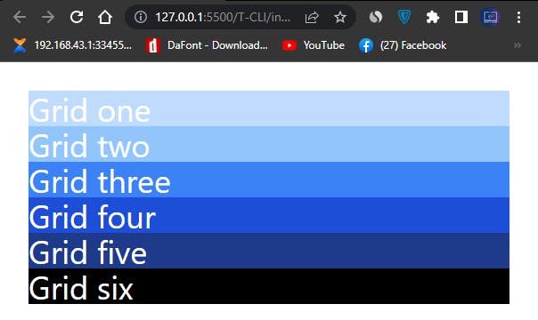 Screenshot of how HTML Element are stacked normally on the web
From the above code, our HTML Element stacked on top each other, this is because we’ve not added any CSS rules that make it do otherwise, so the element are stacked on top each other by default.
Now let’s see what happens when we apply grid template columns.
Type and run the code on your browser
<div>
        <div class="grid grid-cols-3 mt-8 ml-8 mr-8 text-4xl text-white">
            <div class="bg-blue-200">Grid one</div>
            <div class="bg-blue-300">Grid two</div>
            <div class="bg-blue-500">Grid three</div>
            <div class="bg-blue-700">Grid four</div>
            <div class="bg-blue-900">Grid five</div>
            <div class="bg-black">Grid six</div>
        </div>
    </div>
Browser output
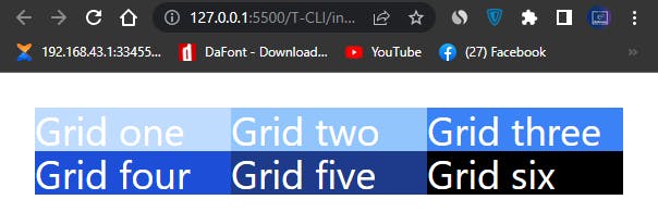 Screenshot of grid template columns in Tailwind CSS
In our second example we added two Tailwind CSS utility classes grid and grid-cols-3 respectively. The grid utility class convert the parent element to a grid container and we use the grid-cols-3 utility class to split our grid-items into a three columns grid.
- GAP: There are times when we need to add extra margin to our grid-items, just like we have
space-xandspace-yin flexbox. We usegaputility class to control how spaces should be distributed within our grid-items. Let’s see how this could be done.
See Illustrated Cheat Sheet below
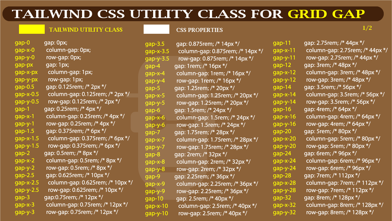 Tailwind CSS Cheat Sheet for Gap (1 of 2)
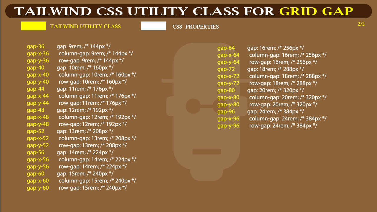 Tailwind CSS Cheat Sheet for Gap (2 of 2)
Type and run the code below
<div>
        <div class="grid grid-cols-3 gap-3 mt-8 ml-8 mr-8 text-4xl text-white">
            <div class="bg-blue-200">Grid one</div>
            <div class="bg-blue-300">Grid two</div>
            <div class="bg-blue-500">Grid three</div>
            <div class="bg-blue-700">Grid four</div>
            <div class="bg-blue-900">Grid five</div>
            <div class="bg-black">Grid six</div>
        </div>
    </div>
Browser output
 Screenshot of grid gap in Tailwind CSS
GRID TEMPLATE ROW:
For better understanding see the grid-template row cheat-sheet.
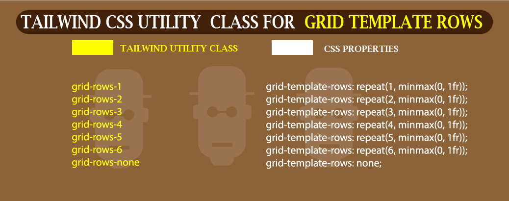 Grid Template row Cheat Sheet In Tailwind CSS
Type and run the code below
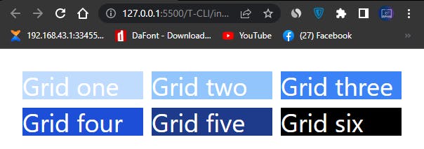
<div>
        <div class="grid grid-rows-3 grid-flow-col gap-3 mt-8 ml-8 mr-8 text-4xl text-white">
            <div class="bg-blue-200">Grid one</div>
            <div class="bg-blue-300">Grid two</div>
            <div class="bg-blue-500">Grid three</div>
            <div class="bg-blue-700">Grid four</div>
            <div class="bg-blue-900">Grid five</div>
            <div class="bg-black">Grid six</div>
        </div>
    </div>
Browser Output
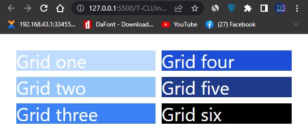
We’ve added grid-rows-3 to our grid container which split our grid items to a three row <div> s. We also added a grid-flow-col which we’ll explain in the next section.
The Illustration below shows us the difference between grid template columns and grid template rows.
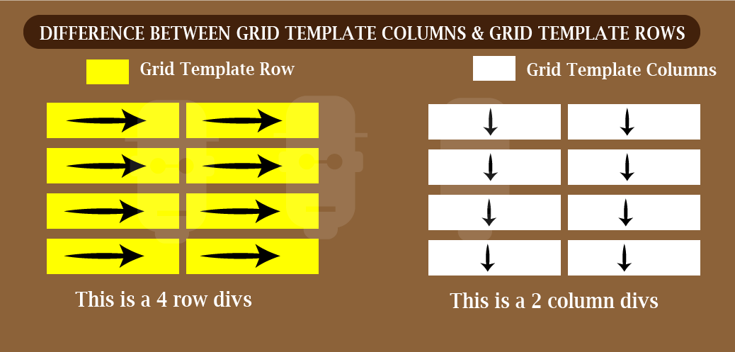 Difference between grid-template columns and grid-template rows
- GRID AUTO FLOW: Utility for controlling how grid-items are placed within the grid container. The grid flow can either be rows or columns. See illustrated cheat-sheet for better understanding.
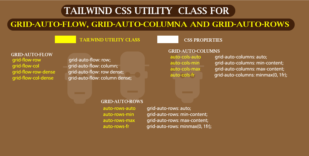 Grid Auto flow Cheat Sheet in Tailwind CSS
Type and run the code in your browser
<div class="mt-8 ml-8 mr-8">
        <p>Grid Auto flow Columns</p>
        <div class="grid grid-rows-3 grid-cols-2 grid-flow-col gap-3  text-4xl text-white">
            <div class="bg-blue-200 col-span-2">Grid one</div>
            <div class="bg-blue-300 col-span-2">Grid two</div>
            <div class="bg-blue-500 col-span-2">Grid three</div>
            <div class="bg-blue-700">Grid four</div>
            <div class="bg-blue-900">Grid five</div>
            <div class="bg-black">Grid six</div>
        </div>
    </div>

    <div class="mt-8 ml-8 mr-8">
        <p>Grid Auto flow rows</p>
        <div class="grid grid-rows-3 grid-cols-2 grid-flow-row gap-3  text-4xl text-white">
            <div class="bg-red-200 col-span-2">Grid one</div>
            <div class="bg-red-300 col-span-2">Grid two</div>
            <div class="bg-red-500 col-span-2">Grid three</div>
            <div class="bg-red-700">Grid four</div>
            <div class="bg-red-900">Grid five</div>
            <div class="bg-black">Grid six</div>
        </div>
    </div>
Browser Output
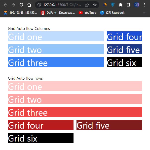 Grid Auto Flow in Tailwind CSS
- GRID SPAN: We can span (merge) two rows or columns together in Tailwind CSS. The code below shows us how to do it.
See illustration for better understanding
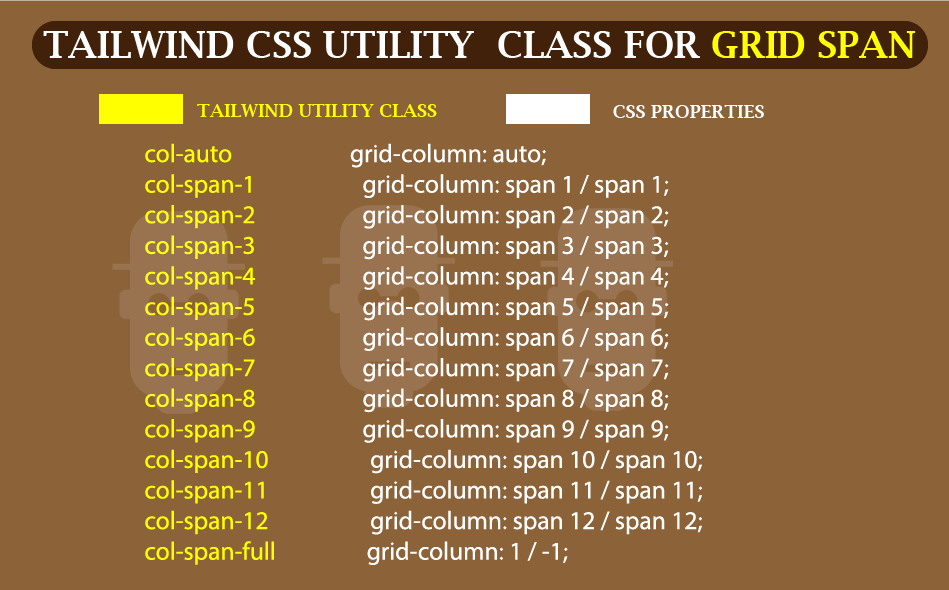 Screenshot of Tailwind CSS Cheat Sheet
Type and run the code below
<div class="mt-8 ml-8 mr-8">
        <p>Using Columns Span</p>
        <div class="grid grid-cols-4 gap-3  text-4xl text-white">
            <div class="bg-blue-200">Grid one</div>
            <div class="bg-blue-300">Grid two</div>
            <div class="bg-blue-500">Grid three</div>
            <div class="bg-blue-700">Grid four</div>
            <div class="bg-blue-900 col-span-3">Grid five</div>
            <div class="bg-black">Grid six</div>
        </div>
    </div>
Browser output
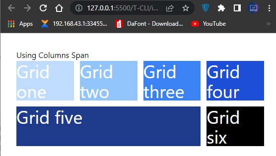 How to use Grid-Span in Tailwind CSS
- GRID COLUMN START/END
the col-start-{n} and col-end-{n} enable us to set where our grid items are placed on a grid line within our grid container. This can either be at the starting col-start-{n} or at the end col-end-{n} . To make use of col-start-{n} and col-end-{n} we have to first set a grid-cols-{n} , the number of columns our grid-items are split into within a grid container will determine the number of grid line available to us.
See illustration for better understanding
For example the code sample below is set to a grid-cols-4 which split our grid items into a four columns grid.
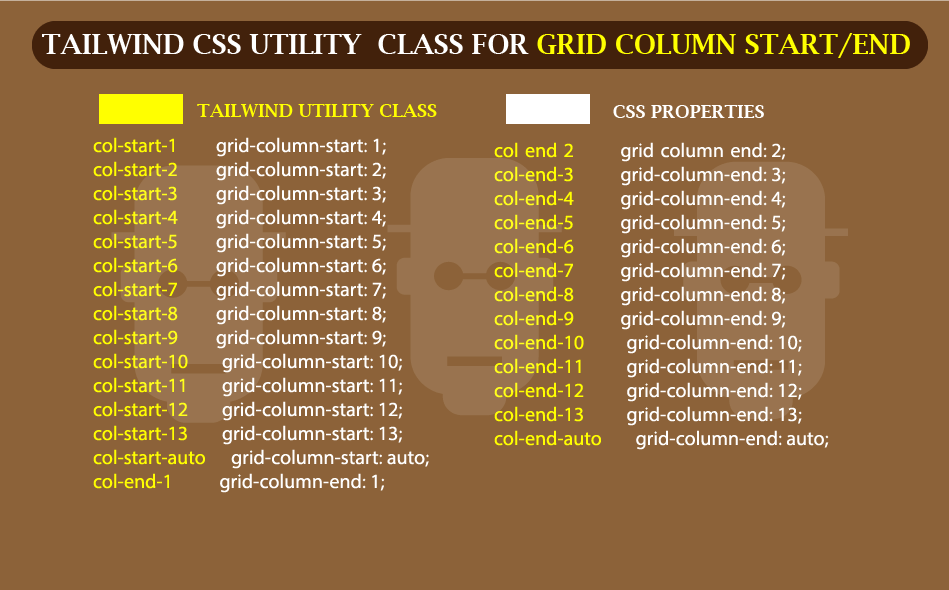 Illustrated Cheat Sheet for Grid column start/End
Since CSS grid lines starts at 1 rather than 0, so spanning across the full width will start from line 1 to line 5.
The code below explain it better.
<body>
    <div class="mt-8 ml-8 mr-8">
        <p>Normal Display</p>
        <div class="grid grid-cols-4 gap-3  text-4xl text-white">
            <div class="bg-red-100">Grid one</div>
            <div class="bg-red-200">Grid two</div>
            <div class="bg-red-300">Grid three</div>
            <div class="bg-red-400">Grid four</div>
            <div class="bg-red-500">Grid five</div>
            <div class="bg-red-600">Grid Six</div>
            <div class="bg-red-700">Grid Seven</div>
            <div class="bg-red-800">Grid Eight</div>
            <div class="bg-red-900">Grid Nine</div>
            <div class="bg-black">Grid Ten</div>
        </div>
    </div>

    <div class="mt-8 ml-8 mr-8">
        <p>Applying starting and ending lins</p>
        <div class="grid grid-cols-4 gap-3  text-4xl text-white">
            <div class="bg-red-100">Grid one</div>
            <div class="bg-red-200 col-start-4">Grid two</div>
            <div class="bg-red-300">Grid three</div>
            <div class="bg-red-400 col-end-4">Grid four</div>
            <div class="bg-red-500 col-start-1">Grid five</div>
            <div class="bg-red-600 col-span-3">Grid Six</div>
            <div class="bg-red-700 col-end-2">Grid Seven</div>
            <div class="bg-red-800 col-span-3">Grid Eight</div>
            <div class="bg-red-900 col-end-3">Grid Nine</div>
            <div class="bg-black col-start-1 col-end-5">Grid Ten</div>
        </div>
    </div>
</body>
Browser output
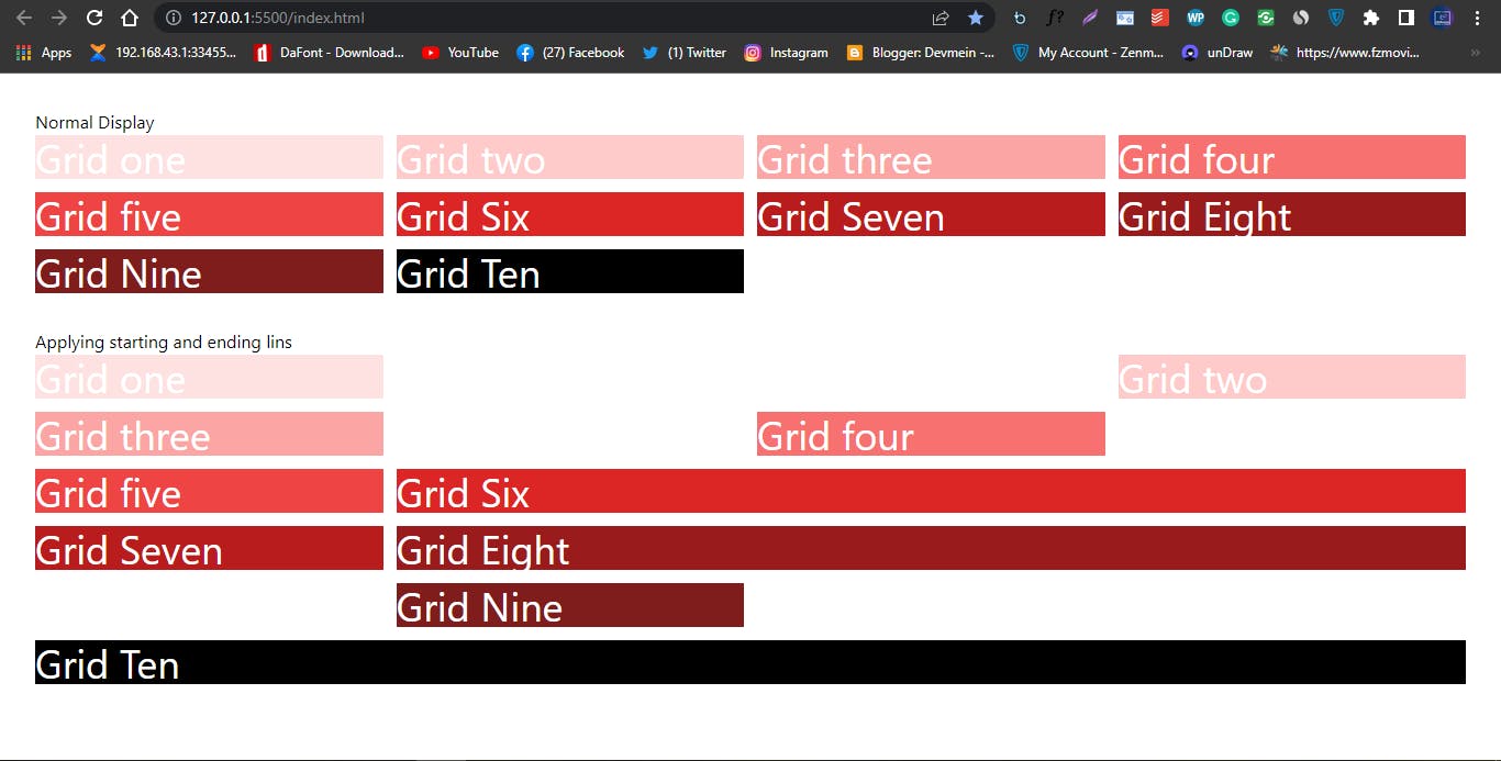 Screenshot of how to add grid items to start and end of a grid line
Notice: how grid two is placed at the last edge of the browser after we set col-start-4 to it. And grid ten takes up the full width after we assign it a utility class of col-end-5 .
- GRID ROW START/END:
We’ve talked about Grid column start/End. The row grid start/end Tailwind CSS does the same thing, but this time on the row axis.
See illustration for better understanding.
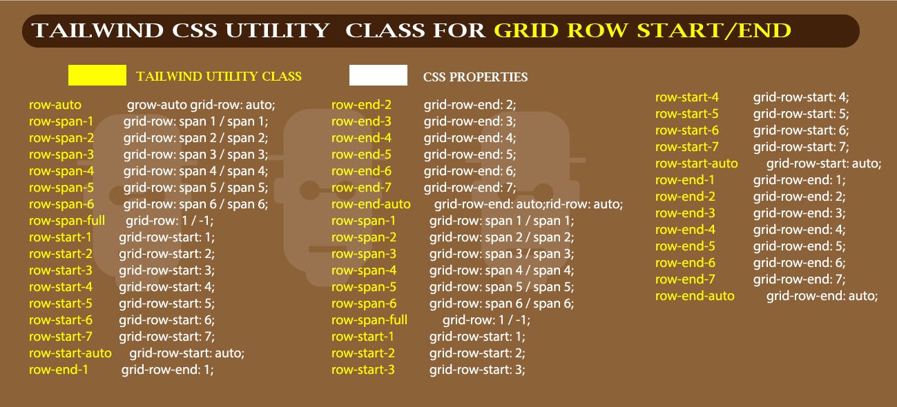 Tailwind CSS Utility class Cheat Sheet for Grid column start/end
Type and run the code example below
Tailwind CSS Utility class Cheat Sheet for Grid column start/end
Type and run the code example below
<body>
    <div class="mt-8 ml-8 mr-8">
        <p>Normal Display</p>
        <div class="grid grid-cols-4 gap-3  text-4xl text-white">
            <div class="bg-orange-100">Grid one</div>
            <div class="bg-orange-200">Grid two</div>
            <div class="bg-orange-300">Grid three</div>
            <div class="bg-orange-400">Grid four</div>
        </div>
    </div>

    <div class="mt-8 ml-8 mr-8">
        <p>Applying starting and ending lins</p>
        <div class="grid grid-cols-4 gap-3  text-4xl text-white">
            <div class="bg-orange-100">Grid one</div>
            <div class="bg-orange-200 row-span-3">Grid two</div>
            <div class="bg-orange-300">Grid three</div>
            <div class="bg-orange-400 row-start-2">Grid four</div>

        </div>
    </div>
</body>
Browser output
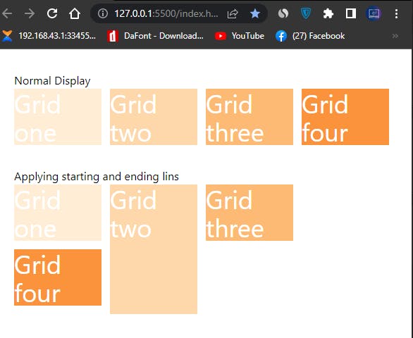 Screenshot of grid row start/end in Tailwind CSS
Note: This differences in Grid two and Grid four <div> tags, where grid two is spanning two rows from top to bottom and Grid four is repositioned at the right hand rather than the default left.
- JUSTIFY CONTENT: Is used to set where an element is placed within it flex container and grid container. This is done across the main axis. To do this we have to append some values to it, such as;
justify-start,justify-end,justify-center,justify-between,justify-aroundandjustify-evenly.
see cheat sheet for better understanding.
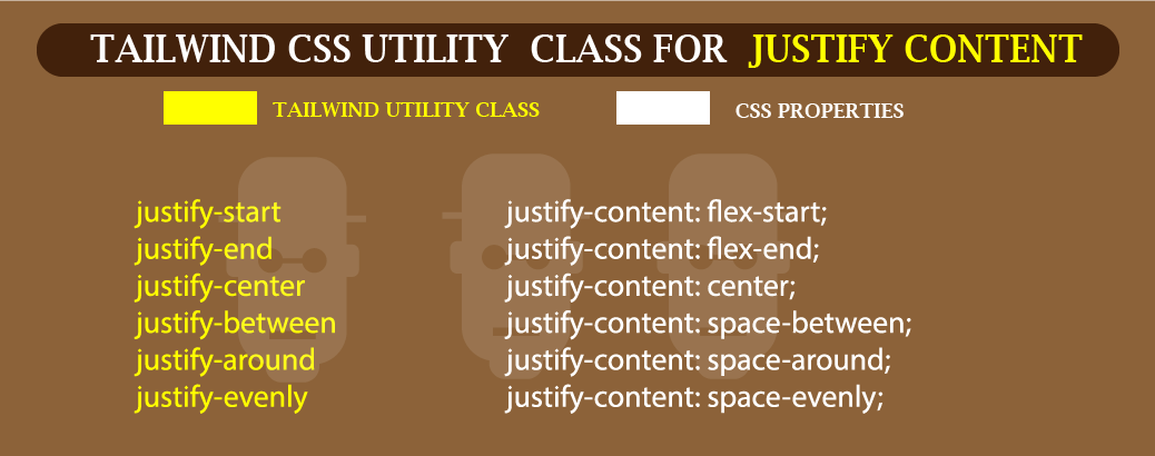 Justify content cheat sheet in Tailwind CSS
Type and run the code below below
<div class="mt-8 ml-8 mr-8">
        <p>Justify Content</p>
        <div class="flex justify-center">
            <div class="bg-black text-white w-24 h-24">ONE</div>
            <div class="bg-black text-white w-24 h-24">TWO</div>
            <div class="bg-black text-white w-24 h-24">THREE</div>
            <div class="bg-black text-white w-24 h-24">FOUR</div>
        </div>
    </div>
Browser output
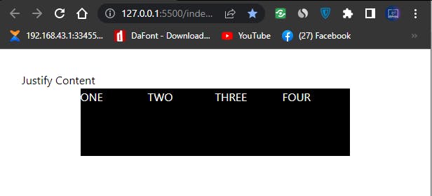 Flex justify content-center
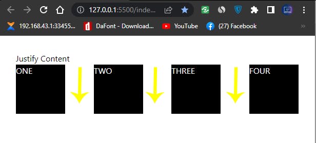
- Justify-end: used to place flex-items at the of the flex container.
Type and run the code below below
<div class="mt-8 ml-8 mr-8">
        <p>Justify Content</p>
        <div class="flex justify-end">
            <div class="bg-black text-white w-24 h-24">ONE</div>
            <div class="bg-black text-white w-24 h-24">TWO</div>
            <div class="bg-black text-white w-24 h-24">THREE</div>
            <div class="bg-black text-white w-24 h-24">FOUR</div>
        </div>
    </div>
Browser output
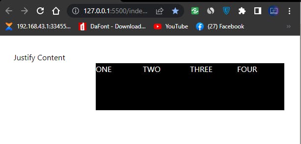 Justify-end In flex Tailwind CSS
- justify-start: used to place flex-items at the beginning of the flex container. This is usually the default.
Type and run the code below below
<div class="mt-8 ml-8 mr-8">
        <p>Justify Content</p>
        <div class="flex justify-start">
            <div class="bg-black text-white w-24 h-24">ONE</div>
            <div class="bg-black text-white w-24 h-24">TWO</div>
            <div class="bg-black text-white w-24 h-24">THREE</div>
            <div class="bg-black text-white w-24 h-24">FOUR</div>
        </div>
    </div>
Browser output
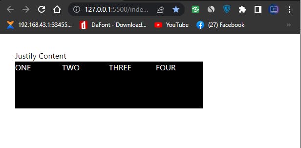 Justify Start Flex in Tailwind CSS
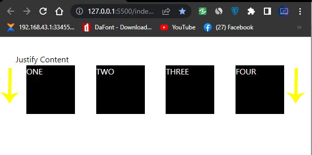
- justify-between: used to set how spaces are distributed between the flex container.
Type and run the code below below
<div class="mt-8 ml-8 mr-8">
        <p>Justify Content</p>
        <div class="flex justify-between">
            <div class="bg-black text-white w-24 h-24">ONE</div>
            <div class="bg-black text-white w-24 h-24">TWO</div>
            <div class="bg-black text-white w-24 h-24">THREE</div>
            <div class="bg-black text-white w-24 h-24">FOUR</div>
        </div>
    </div>
Browser output
 Justify-Around in Tailwind
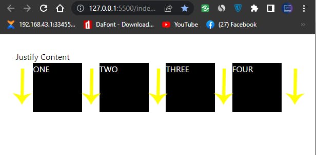
- justify-around: used to set how spaces are distributed around the flex container.
Type and run the code below below
<body>
    <div class="mt-8 ml-8 mr-8">
        <p>Justify Content</p>
        <div class="flex justify-around">
            <div class="bg-black text-white w-24 h-24">ONE</div>
            <div class="bg-black text-white w-24 h-24">TWO</div>
            <div class="bg-black text-white w-24 h-24">THREE</div>
            <div class="bg-black text-white w-24 h-24">FOUR</div>
        </div>
    </div>
</body>
Browser Output
 justify-around in Tailwind CSS
- justify-evenly: used to set spaces evenly within the flex container.
Type and run the code below below
<body>
    <div class="mt-8 ml-8 mr-8">
        <p>Justify Content</p>
        <div class="flex justify-evenly">
            <div class="bg-black text-white w-24 h-24">ONE</div>
            <div class="bg-black text-white w-24 h-24">TWO</div>
            <div class="bg-black text-white w-24 h-24">THREE</div>
            <div class="bg-black text-white w-24 h-24">FOUR</div>
        </div>
    </div>
</body>
Browser Output
NOTE: that the justify content property is also applicable on grid, for example.
applying a justify-end to a grid container will set our grid item to the end within the grid container.
The code example below explain it better.
<body>
    <div class="mt-8 ml-8 mr-8">
        <p>Justify Content</p>
        <div class="grid justify-center">
            <div class="bg-black text-white w-24 h-24">ONE</div>
            <div class="bg-black text-white w-24 h-24">TWO</div>
            <div class="bg-black text-white w-24 h-24">THREE</div>
            <div class="bg-black text-white w-24 h-24">FOUR</div>
        </div>
    </div>
</body>
Browser Output
 justify-center grid in Tailwind CSS
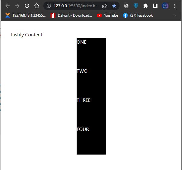
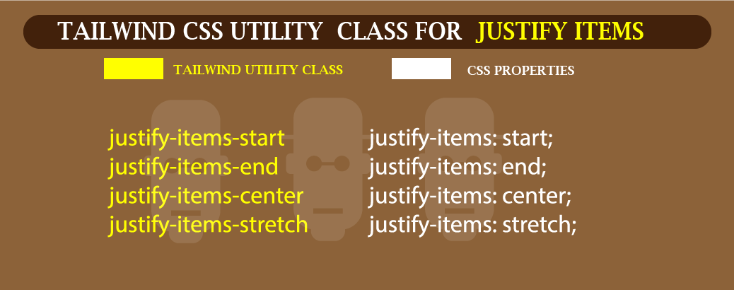
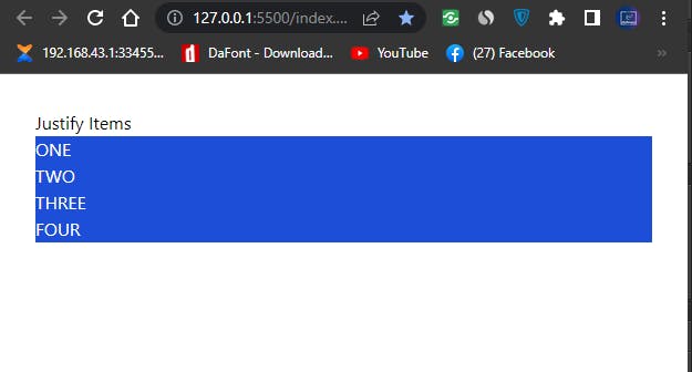
- JUSTIFY ITEMS: To set how grid items are place around within the container along the inline axis. This utility class have 4 values that we can append to the justify-items utility class to make it align along the inline axis. This includes;
justify-items-startjustify-items-endjustify-items-centerjustify-items-stretch
See illustration cheat sheep for better understanding
 Tailwind Cheat Sheet for Justify Items
- justify-items-start: used to place grid-items at the beginning of the grid-container along the inline axis. This is usually the default.
Type and run the code below.
<body>
    <div class="mt-8 ml-8 mr-8">
        <p>Justify Items</p>
        <div class="grid justify-items-start">
            <div class="bg-blue-700 text-white w-24 h-24">ONE</div>
            <div class="bg-blue-700 text-white w-24 h-24">TWO</div>
            <div class="bg-blue-700 text-white w-24 h-24">THREE</div>
            <div class="bg-blue-700 text-white w-24 h-24">FOUR</div>
        </div>
    </div>
</body>
Browser Output
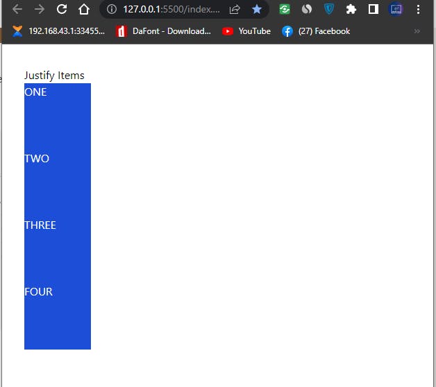 screenshot justify items start in Tailwind
- justify-items-center: used to place grid-items at the middle of the grid-container along the inline axis.
Type and run the code below
<body>
    <div class="mt-8 ml-8 mr-8">
        <p>Justify Items</p>
        <div class="grid justify-items-center">
            <div class="bg-blue-700 text-white w-24 h-24">ONE</div>
            <div class="bg-blue-700 text-white w-24 h-24">TWO</div>
            <div class="bg-blue-700 text-white w-24 h-24">THREE</div>
            <div class="bg-blue-700 text-white w-24 h-24">FOUR</div>
        </div>
    </div>
</body>
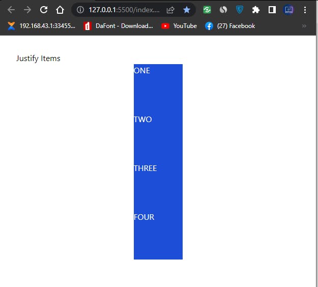 screenshot justify items center in Tailwind
- justify-items-end: used to place grid-items at the end of the grid-container along the inline axis.
type and run the code below
<body>
    <div class="mt-8 ml-8 mr-8">
        <p>Justify Items</p>
        <div class="grid justify-items-end">
            <div class="bg-blue-700 text-white w-24 h-24">ONE</div>
            <div class="bg-blue-700 text-white w-24 h-24">TWO</div>
            <div class="bg-blue-700 text-white w-24 h-24">THREE</div>
            <div class="bg-blue-700 text-white w-24 h-24">FOUR</div>
        </div>
    </div>
</body>
Browser Output
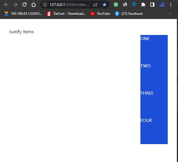
screenshot justify items in Tailwind
- justify-items-stretch: used to place grid-items at the beginning /ending of the grid-container along the inline axis.
Type and run the code below
<body>
    <div class="mt-8 ml-8 mr-8">
        <p>Justify Items</p>
        <div class="grid justify-items-stretch">
            <div class="bg-blue-700 text-white">ONE</div>
            <div class="bg-blue-700 text-white">TWO</div>
            <div class="bg-blue-700 text-white">THREE</div>
            <div class="bg-blue-700 text-white">FOUR</div>
        </div>
    </div>
</body>
Browser Output
 screenshot justify items stretch in Tailwind
- JUSTIFY SELF: Enable us to set how a particular grid item is align within its inline axis.
see cheat sheet for better understanding.
 see cheat sheet for better understanding.
- justify-self-start: for aligning grid items to the start of its inline axis.
Type and run the code below.
<body>
    <div class="mt-8 ml-8 mr-8">
        <p>Normal Display</p>
        <div class="grid justify-items-stretch">
            <div class="bg-pink-700 text-white">ONE</div>
            <div class="bg-pink-700 text-white">TWO</div>
            <div class="bg-pink-900 text-white">THREE</div>
            <div class="bg-pink-700 text-white">FOUR</div>
        </div>
    </div>

    <div class="mt-8 ml-8 mr-8">
        <p>Justify Self</p>
        <div class="grid justify-items-stretch">
            <div class="bg-pink-700 text-white">ONE</div>
            <div class="bg-pink-700 text-white">TWO</div>
            <div class="bg-pink-900 text-white justify-self-start">THREE</div>
            <div class="bg-pink-700 text-white">FOUR</div>
        </div>
    </div>
</body>
Browser Output:
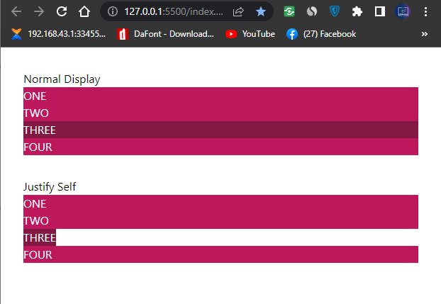
Justify-self in Tailwind CSS
- justify-self-center: for aligning grid items to the center of its inline axis.
Type and run the code below.
<body>
    <div class="mt-8 ml-8 mr-8">
        <p>Normal Display</p>
        <div class="grid justify-items-stretch">
            <div class="bg-pink-700 text-white">ONE</div>
            <div class="bg-pink-700 text-white">TWO</div>
            <div class="bg-pink-900 text-white">THREE</div>
            <div class="bg-pink-700 text-white">FOUR</div>
        </div>
    </div>

    <div class="mt-8 ml-8 mr-8">
        <p>Justify Self</p>
        <div class="grid justify-items-stretch">
            <div class="bg-pink-700 text-white">ONE</div>
            <div class="bg-pink-700 text-white">TWO</div>
            <div class="bg-pink-900 text-white justify-self-center">THREE</div>
            <div class="bg-pink-700 text-white">FOUR</div>
        </div>
    </div>
</body>
Browser Output:
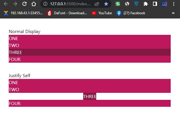 Justify-self center in Tailwind CSS
justify-self-end: for aligning grid items to the end of its inline axis.
Type and run the code below.
<body>
    <div class="mt-8 ml-8 mr-8">
        <p>Normal Display</p>
        <div class="grid justify-items-stretch">
            <div class="bg-pink-700 text-white">ONE</div>
            <div class="bg-pink-700 text-white">TWO</div>
            <div class="bg-pink-900 text-white">THREE</div>
            <div class="bg-pink-700 text-white">FOUR</div>
        </div>
    </div>

    <div class="mt-8 ml-8 mr-8">
        <p>Justify Self</p>
        <div class="grid justify-items-stretch">
            <div class="bg-pink-700 text-white">ONE</div>
            <div class="bg-pink-700 text-white">TWO</div>
            <div class="bg-pink-900 text-white justify-self-end">THREE</div>
            <div class="bg-pink-700 text-white">FOUR</div>
        </div>
    </div>
</body>
Browser output
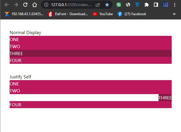 Justify Self End In Tailwind CSS
- justify-self-stretch: for aligning grid items to the stretch from start to end of its inline axis.
Type and run the code below.
<body>
    <div class="mt-8 ml-8 mr-8">
        <p>Normal Display</p>
        <div class="grid justify-items-stretch">
            <div class="bg-pink-700 text-white">ONE</div>
            <div class="bg-pink-700 text-white">TWO</div>
            <div class="bg-pink-900 text-white">THREE</div>
            <div class="bg-pink-700 text-white">FOUR</div>
        </div>
    </div>

    <div class="mt-8 ml-8 mr-8">
        <p>Justify Self</p>
        <div class="grid justify-items-stretch">
            <div class="bg-pink-700 text-white">ONE</div>
            <div class="bg-pink-700 text-white">TWO</div>
            <div class="bg-pink-900 text-white justify-self-stretch">THREE</div>
            <div class="bg-pink-700 text-white">FOUR</div>
        </div>
    </div>
</body>
Browser output
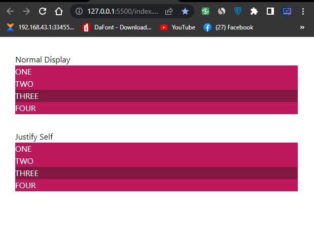 Justify Self Stretch In Tailwind CSS
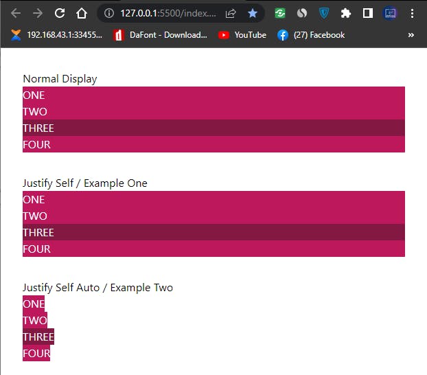
- justify-self-auto: for aligning grid items to align based on the value provided by the
justify-itemsproperty. That is if the parent grid container is set tostretchthegrid-self-autowill be set to stretch, if its set tostartthegrid-self-autowill be set to it will be set to start, and so on.
Type and run the code below for better understanding.
<body>
    <div class="mt-8 ml-8 mr-8">
        <p>Normal Display</p>
        <div class="grid justify-items-stretch">
            <div class="bg-pink-700 text-white">ONE</div>
            <div class="bg-pink-700 text-white">TWO</div>
            <div class="bg-pink-900 text-white">THREE</div>
            <div class="bg-pink-700 text-white">FOUR</div>
        </div>
    </div>

    <div class="mt-8 ml-8 mr-8">
        <p>Justify Self / Example One</p>
        <div class="grid justify-items-stretch">
            <div class="bg-pink-700 text-white">ONE</div>
            <div class="bg-pink-700 text-white">TWO</div>
            <div class="bg-pink-900 text-white justify-self-auto">THREE</div>
            <div class="bg-pink-700 text-white">FOUR</div>
        </div>
    </div>

    <div class="mt-8 ml-8 mr-8">
        <p>Justify Self Auto / Example Two</p>
        <div class="grid justify-items-start">
            <div class="bg-pink-700 text-white">ONE</div>
            <div class="bg-pink-700 text-white">TWO</div>
            <div class="bg-pink-900 text-white justify-self-auto">THREE</div>
            <div class="bg-pink-700 text-white">FOUR</div>
        </div>
    </div>
</body>
Browser output
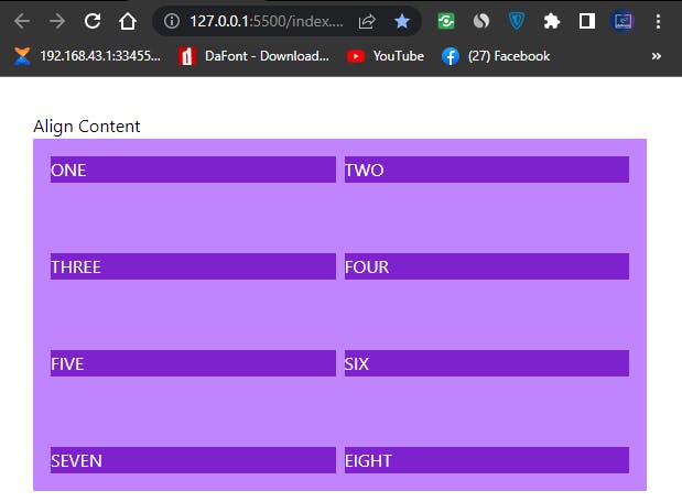
- ALIGN CONTENT: Used to set how row are align on a multi-row grid or flex-items, within a grid and flex container. For example if we set a defined height to a grid or flex container we can used the
align-contentto determine how the flex-items are positioned within the grid or flex container.
See Cheat Sheet below
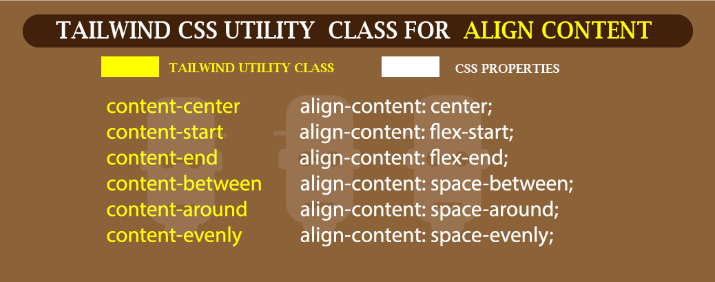 See Cheat Sheet below
Type and run the code below
<div class="mt-8 ml-8 mr-8">
        <p>Align Content</p>
        <div class="h-80 bg-purple-400 p-4 grid grid-cols-4 gap-2">
            <div class="bg-purple-700 text-white">ONE</div>
            <div class="bg-purple-700 text-white">TWO</div>
            <div class="bg-purple-700 text-white">THREE</div>
            <div class="bg-purple-700 text-white">FOUR</div>
            <div class="bg-purple-700 text-white">FIVE</div>
            <div class="bg-purple-700 text-white">SIX</div>
            <div class="bg-purple-700 text-white">SEVEN</div>
            <div class="bg-purple-700 text-white">EIGHT</div>
        </div>
    </div>
Browser Output
 Align Content in Tailwind CSS.
From the above code example, we have a four grid columns, which is separated with a grid gap-4, a height of 20rem (h-80).
For the grid container, the background is set to a utility class of bg-purple-400 while the grid items take a utility class of bg-purple-700. Without the align-content assign to the grid-item, each items take up the full width of the grid container.
The next example explain how to apply align-content to flex or grid items.
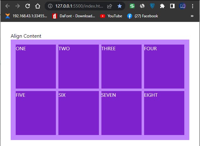
- content-start: use to align row at the top of the flex or grid container. (Cross Axis).
Type and run the code below.
<div class="h-80 bg-purple-400 p-4 grid grid-cols-4 gap-2 content-start">
add the content-start utility class to the direct parent container of grid-items.
Browser Output
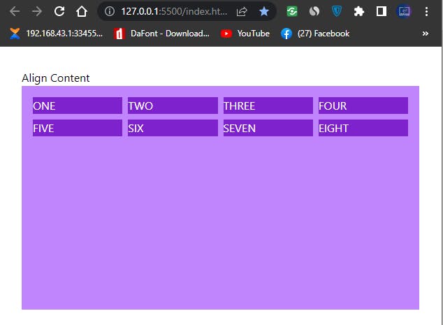
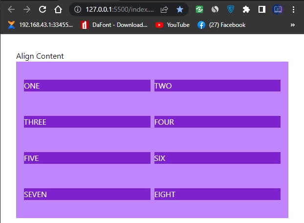
- content-center: use to align row at the center of the flex or grid container. (Cross Axis).
Type and run the code below.
<div class="h-80 bg-purple-400 p-4 grid grid-cols-4 gap-2 content-center">
Browser Output
 Align Content Center in Tailwind CSS
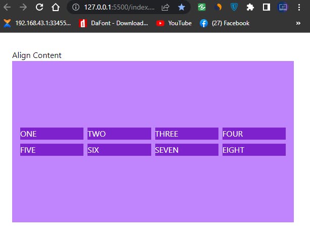
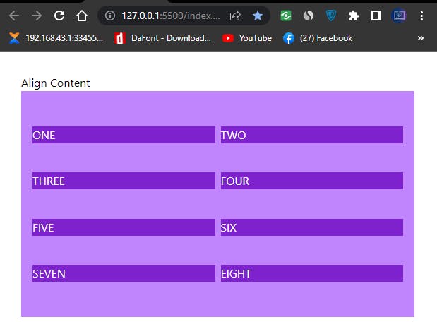
- content-end: use to align row at the end of the flex or grid container. (Cross Axis).
Type and run the code below
<div class="h-80 bg-purple-400 p-4 grid grid-cols-4 gap-2 content-end">
Browser Output
 Align Content end in Tailwind CSS
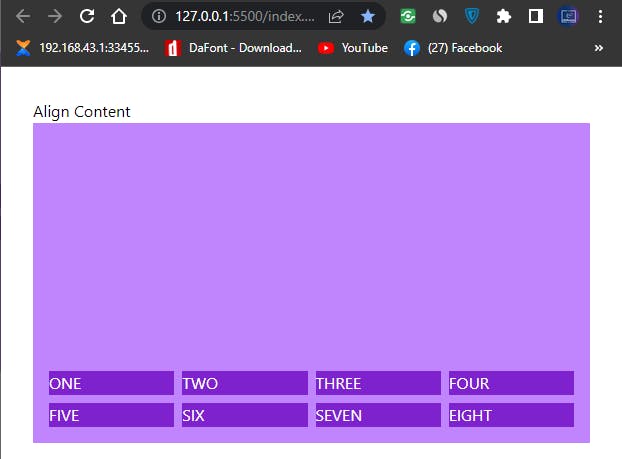
- content-between: use to distribute equal amount of space between multi row grid or flex items with in a flex or grid container. (Cross Axis).
Note that we change our grid-items from a four columns to two columns grid for better understanding.
Type and run the code below
<div class="h-80 bg-purple-400 p-4 grid grid-cols-2 gap-2 content-between">
Browser Output
 Align Content Between in Tailwind CSS
- content-around: use to distribute equal amount of space around multi row grid or flex items with in a flex or grid container. (Cross Axis).
Note that we have more space distributed around our grid-items compare to space-between.
Type and run the code below.
<div class="h-80 bg-purple-400 p-4 grid grid-cols-2 gap-2 content-around">
Browser Output
 Align Content Around in Tailwind CSS
- content-evenly: use to distribute equal amount of space between and around multi row grid or flex items within a flex or grid container. (Cross Axis).
Note the equal amount of space between and around our grid-items.
type and run the code below.
<div class="h-80 bg-purple-400 p-4 grid grid-cols-2 gap-2 content-evenly">
Browser Output
 Align Content Evenly in Tailwind CSS
ALIGN ITEMS: Use to align flex and grid items on the cross axis within their flex or grid container.
The cross axis to put it a more simple term means top to bottom.
Note that in this section we maintained the same height and numbers of
divsfrom our previous section. We also make some changes to the background-color and added padding to some items which in this case arepy-5,py-3,py-6,py-12,py-7respectively.The next example explain how to apply align-items to flex or grid items.
See Cheat Sheet for better understanding.
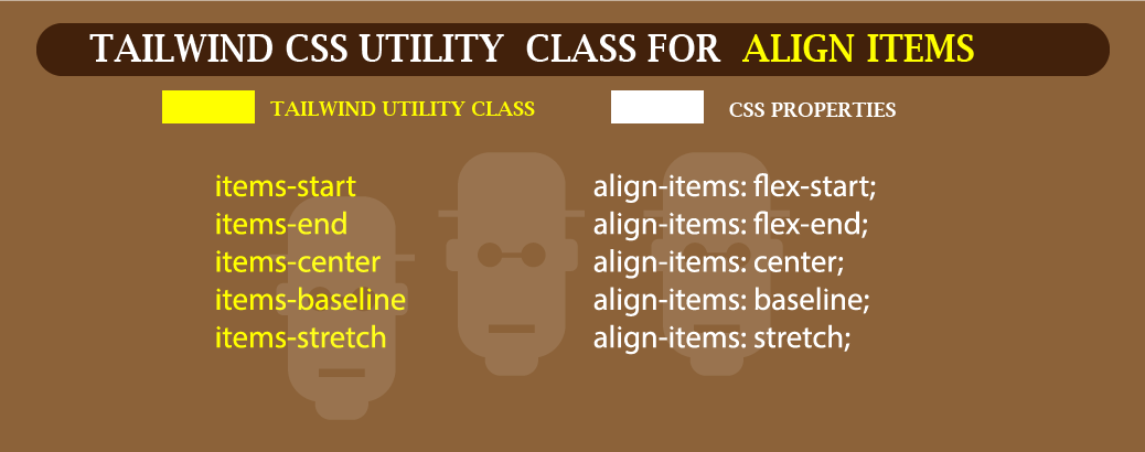 Align Items in Tailwind CSS
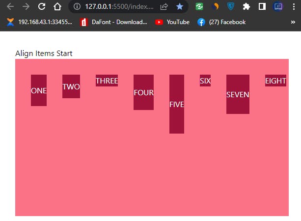
- items-start: Use to align flex and grid items to the start on the cross axis within their flex or grid container.
Type and run the code below.
<body>
    <div class="mt-8 ml-8 mr-8">
        <p>Align Content</p>
        <div class="h-80 bg-rose-400 p-4 flex items-start">
            <div class="m-4 bg-rose-800 text-white py-5">ONE</div>
            <div class="m-4 bg-rose-800 text-white py-3">TWO</div>
            <div class="m-4 bg-rose-800 text-white">THREE</div>
            <div class="m-4 bg-rose-800 text-white py-6">FOUR</div>
            <div class="m-4 bg-rose-800 text-white py-12">FIVE</div>
            <div class="m-4 bg-rose-800 text-white">SIX</div>
            <div class="m-4 bg-rose-800 text-white py-7">SEVEN</div>
            <div class="m-4 bg-rose-800 text-white">EIGHT</div>
        </div>
    </div>
</body>
Browser Output
 align items start in Tailwind CSS
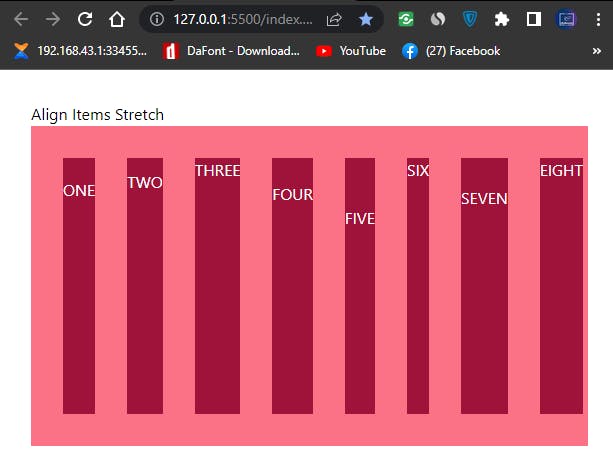
- items-stretch: Use to align flex and grid items to fill the cross axis within their flex or grid container.
Type and run the code below.
<div class="h-80 bg-rose-400 p-4 flex items-stretch">
Browser Output
 align items stretch in Tailwind
Note how flex items are stretched from top to bottom.
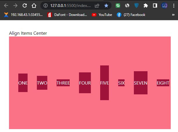
- items-center: Use to align flex and grid items to the center on the cross axis within their flex or grid container.
Type and run the code below.
<div class="h-80 bg-rose-400 p-4 flex items-center">
Browser Output
 Align items center in Tailwind
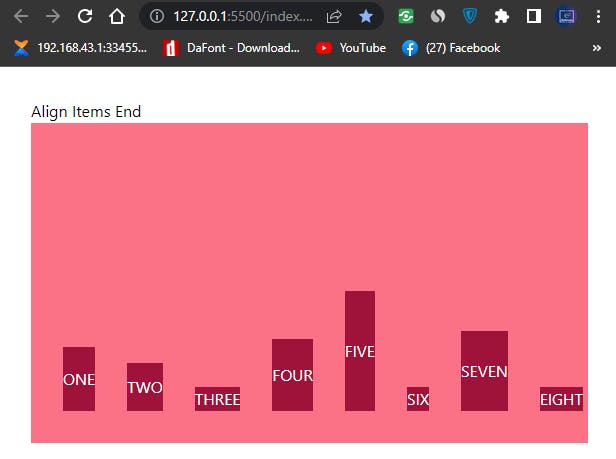
- items-end: Use to align flex and grid items to the end on the cross axis within their flex or grid container.
Type and run the code below.
<div class="h-80 bg-rose-400 p-4 flex items-end">
Browser Output
 Align Items End In Tailwind
- items-baseline: Use to align flex and grid items to baseline on the cross axis within their flex or grid container.
Type and run the code below.
<div class="h-80 bg-rose-400 p-4 flex items-baseline">
Browser Output
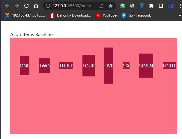 Align Items Baseline in Tailwind
From our browser output, you will have notice how the text content on the individual items are all align on a straight line irrespective of the various sizes of the flex items.
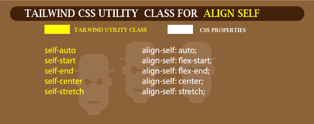
- ALIGN SELF: Is used to align individual flex or grid items along the cross axis of the flex or grid container.
See illustrated Cheat Sheet for better understanding.
 Align-self cheat sheet
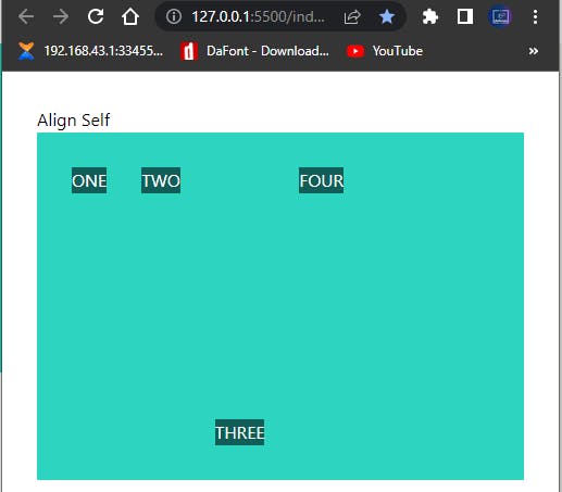
- self-start: Used to align individual item to the start along the cross axis of the flex or grid container irrespective of the
align-itemsvalue.
Type and run the code for better understanding.
<body>
    <div class="mt-8 ml-8 mr-8">
        <p>Align Self</p>
        <div class="h-80 bg-teal-400 p-4 flex items-baseline">
            <div class="m-4 bg-teal-800 text-white">ONE</div>
            <div class="m-4 bg-teal-800 text-white">TWO</div>
            <div class="m-4 bg-teal-800 text-white self-start">THREE</div>
            <div class="m-4 bg-teal-800 text-white">FOUR</div>
    </div>
</body>
Browser Output
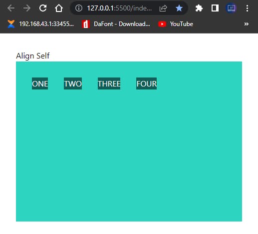 align-self-start in Tailwind CSS
- self-center: Used to align individual item to the center along the cross axis of the flex or grid container irrespective of the
align-itemsvalue.
Type and run the code below.
<div class="m-4 bg-teal-800 text-white self-center">THREE</div>
Browser output
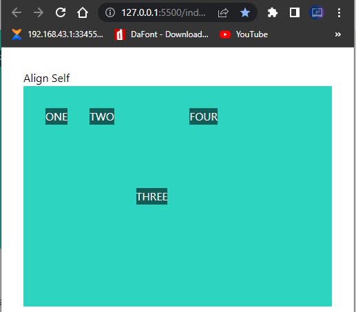 Screenshot of align-self-center in Tailwind CSS.
From our browser output, you’ll notice how our third div is positioned at the center vertically within the container.
- self-end: Used to align individual item to the end along the cross axis of the flex or grid container irrespective of the
align-itemsvalue.
Type and run the code below
<div class="m-4 bg-teal-800 text-white self-end">THREE</div>
Browser output
 Screenshot of align-self-end in Tailwind CSS.
- self-auto: Used to align individual item to the along the cross axis of the flex or grid container based on the value of the align-items property.
Type and run the code below
<div class="mt-8 ml-8 mr-8">
        <p>Align Self</p>
            <div class="h-80 bg-teal-400 p-4 flex items-center">
                <div class="m-4 bg-teal-800 text-white self-start">ONE</div>
                <div class="m-4 bg-teal-800 text-white self-end">TWO</div>
                <div class="m-4 bg-teal-800 text-white self-auto">THREE</div>
                <div class="m-4 bg-teal-800 text-white self-start">FOUR</div>
            </div>
    </div>
Browser output.
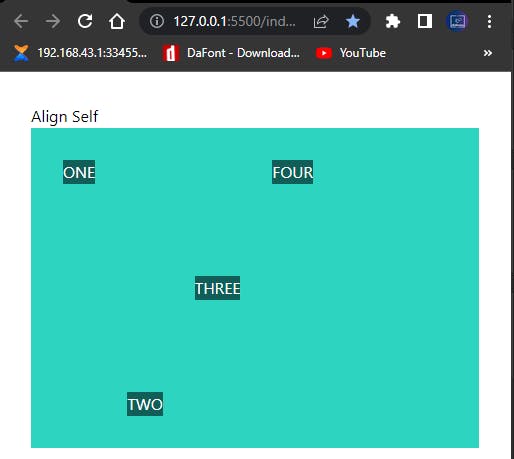 Screenshot of align-self-auto in Tailwind CSS.
From the browser output you’ll notice that our third div remain at the center as soon as we assign self-auto value to it which is based on the align-items value of center while other div's takes the respective position assigned to them.
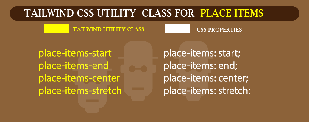
- PLACE-CONTENT: Used to justify and align content with a grid container.
See illustrated Cheat Sheet for better understanding.
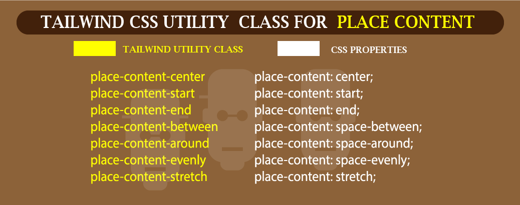 Sheet Cheat for place content in Tailwind CSS.
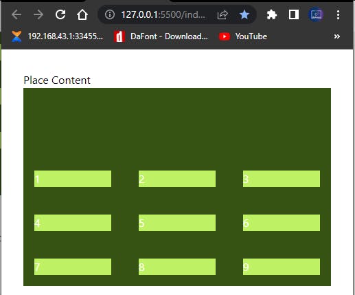
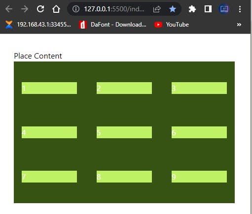
- place-content-start: Used to justify and align items to the start (top) with a grid container.
Type and run the code below
<div class="mt-8 ml-8 mr-8">
        <p>Place Content</p>
            <div class="h-72 grid grid-cols-3 gap-2 bg-lime-900 place-content-start">
                <div class="m-4 bg-lime-300 text-white">1</div>
                <div class="m-4 bg-lime-300 text-white">2</div>
                <div class="m-4 bg-lime-300 text-white">3</div>
                <div class="m-4 bg-lime-300 text-white">4</div>
                <div class="m-4 bg-lime-300 text-white">5</div>
                <div class="m-4 bg-lime-300 text-white">6</div>
                <div class="m-4 bg-lime-300 text-white">7</div>
                <div class="m-4 bg-lime-300 text-white">8</div>
                <div class="m-4 bg-lime-300 text-white">9</div>

    </div>
Browser Output
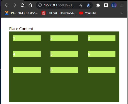 Screenshot of place content start in Tailwind CSS
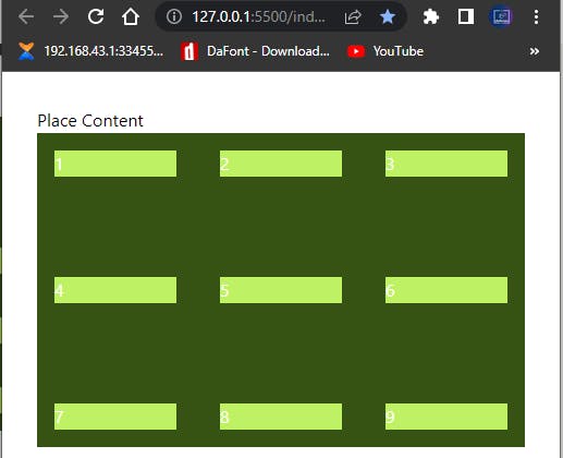
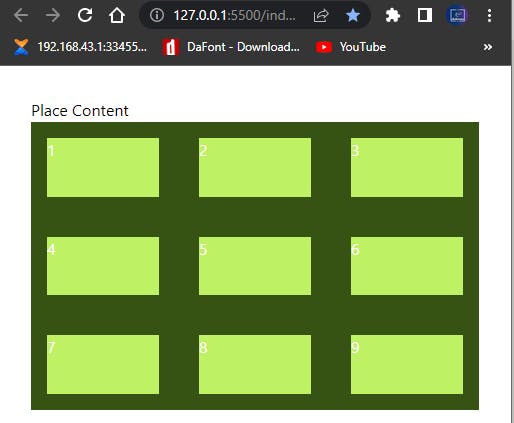
- place-content-center: Used to justify and align items to the center (middle) with a grid container.
Type and run the code below.
<div class="h-72 grid grid-cols-3 gap-2 bg-lime-900 place-content-center">
Browser Output
 Screenshot of place content center in Tailwind CSS
Notice how the items are placed at the middle of the container compare to the first one (place-content-start).
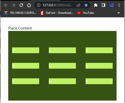
- place-content-end: Used to justify and align items at the end (bottom) with a grid container.
Type and run the code below
<div class="h-72 grid grid-cols-3 gap-2 bg-lime-900 place-content-end">
Browser Output
 Screenshot of place content end in Tailwind CSS
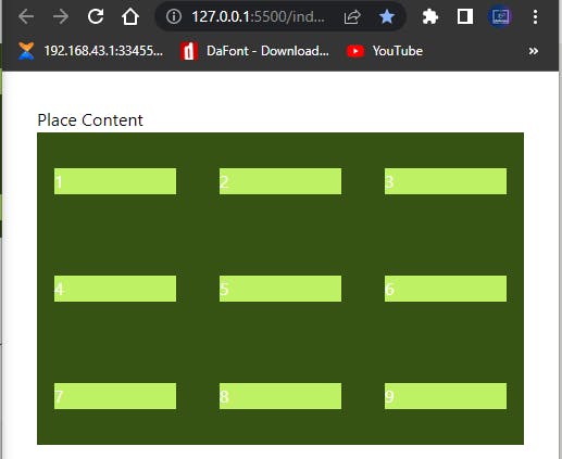
- place-content-between: Used to justify and align items with space equally distributed between each items within a grid container.
Type and run the code below
<div class="h-72 grid grid-cols-3 gap-2 bg-lime-900 place-content-between">
Browser Output
 Screenshot of place content between in Tailwind CSS
Notice how the spaces between each items are equal.
- place-content-between: Used to justify and align items with space equally distributed around each items within a grid container.
Type and run the code below
<div class="h-72 grid grid-cols-3 gap-2 bg-lime-900 place-content-around">
Browser Output
 Screenshot of place content around in Tailwind CSS
place-content-between and place-content-around looks similar, to understand the difference compare the amount of spaces that is distributed between the two.
- place-content-evenly: Used to justify and align items with space equally distributed across each items within a grid container.
Type and run the code below
<div class="h-72 grid grid-cols-3 gap-2 bg-lime-900 place-content-evenly">
Browser Output
 Screenshot of place content evenly in Tailwind CSS
- place-content-stretch: Used to stretch, justify and align items a grid container.
Type and run the code below
<div class="h-72 grid grid-cols-3 gap-2 bg-lime-900 place-content-stretch">
Browser Output
 Screenshot of place content stretch in Tailwind CSS
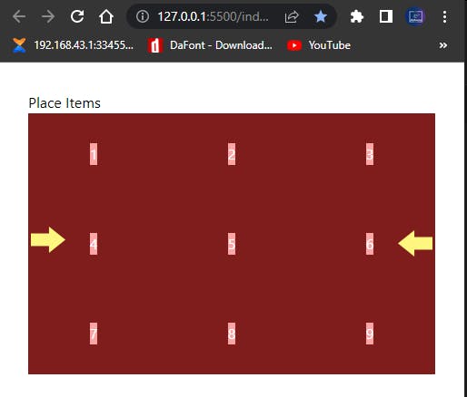
- PLACE ITEMS: Use to justify and align items within a container.
See sheet cheat for better understanding.
 place items in Tailwind CSS
- place-items-start: Use to justify and align items to the start within a container
Type and run the code below.
<div class="mt-8 ml-8 mr-8">
        <p>Place Items</p>
            <div class="h-72 grid grid-cols-3 gap-2 bg-red-900 place-items-start">
                <div class="m-4 bg-red-300 text-white">1</div>
                <div class="m-4 bg-red-300 text-white">2</div>
                <div class="m-4 bg-red-300 text-white">3</div>
                <div class="m-4 bg-red-300 text-white">4</div>
                <div class="m-4 bg-red-300 text-white">5</div>
                <div class="m-4 bg-red-300 text-white">6</div>
                <div class="m-4 bg-red-300 text-white">7</div>
                <div class="m-4 bg-red-300 text-white">8</div>
                <div class="m-4 bg-red-300 text-white">9</div>
    </div>
Browser output.
 Screenshot of place items start in Tailwind CSS
Notice how the entire items are positioned to the start. The yellow arrow indicate the direction in which our items are align. Its okay if you don’t understand how or where the items are positioned, with more and more practice you’ll understand.
- place-items-center: Use to justify and align items to the center within a container
Type and run the code below
<div class="h-72 grid grid-cols-3 gap-2 bg-red-900 place-items-center">
Browser output
 Screenshot of place items center in Tailwind CSS
The two yellow arrows from the browser preview pointing right and left indicate how each flex items are positioned to the center.
- place-items-end: Use to justify and align items to the end within a container
Type and run the code below.
<div class="h-72 grid grid-cols-3 gap-2 bg-red-900 place-items-end">
Browser output
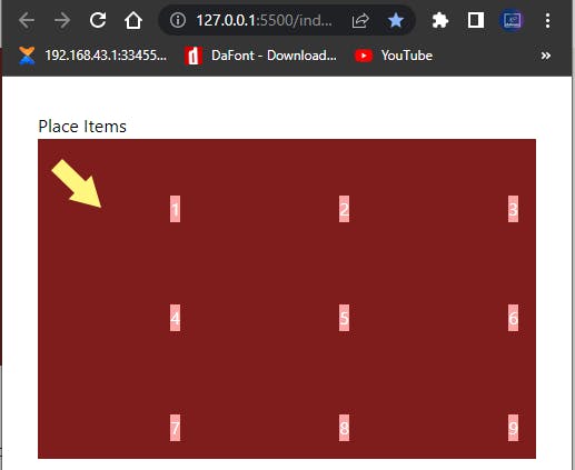 Screenshot of place items end in Tailwind CSS
The yellow arrow points the direction our items are aligned to.
- place-items-stretch: Use to stretch items on the sides along their grid areas within the grid container.
Type and run the code below
<div class="h-72 grid grid-cols-3 gap-2 bg-red-900 place-items-stretch">
Browser Output
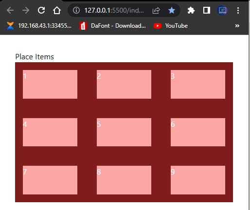 Screenshot of place items stretch in Tailwind CSS
Notice how the items are stretched on both axis, that is the main and the cross axis.
- PLACE SELF: Use to justify and align a particular item within a container. Unlike
place-contentandplace-items,place-selffocuses on the one item our value is assigned to.
See Sheet Cheat for better understanding.
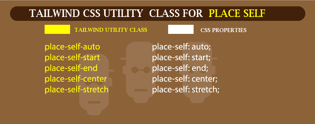 Place Self sheet Cheat in Tailwind CSS
- place-self-start: Use to justify and align a particular item to the start within a container
Type and run the code below
<div class="mt-8 ml-8 mr-8">
        <p>Place Self</p>
            <div class="h-72 grid grid-cols-3 gap-2 bg-sky-900 place-items-stretch">
                <div class="m-4 bg-sky-300 text-white">1</div>
                <div class="m-4 bg-sky-300 text-white">2</div>
                <div class="m-4 bg-sky-300 text-white">3</div>
                <div class="m-4 bg-sky-300 text-white place-self-start">4</div>
                <div class="m-4 bg-sky-300 text-white">5</div>
                <div class="m-4 bg-sky-300 text-white">6</div>
                <div class="m-4 bg-sky-300 text-white">7</div>
                <div class="m-4 bg-sky-300 text-white">8</div>
                <div class="m-4 bg-sky-300 text-white">9</div>
    </div>
Browser output
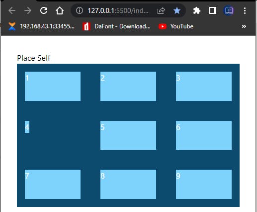 Screenshot of place self start in Tailwind CSS
Notice how the fourth div item is positioned to the start while other items remained stacked where they are.
- place- start-center: Use to justify and align a particular item to the center within a container
Type and run the code below
<div class="m-4 bg-sky-300 text-white place-self-center">4</div>
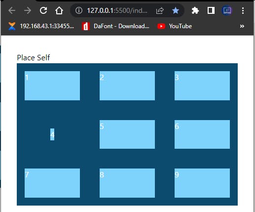 Screenshot of place self center in Tailwind CSS
- place-self-end: Use to justify and align a particular item to the end within the parent container
Type and run the code below
<div class="m-4 bg-sky-300 text-white place-self-end">4</div>
Browser output
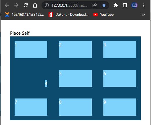 Screenshot of place self end in Tailwind CSS
- place-self-auto: Use to justify and align a particular item based on the parent element value of the
place-itemsproperty.
Type and run the code below.
<div class="m-4 bg-sky-300 text-white place-self-auto">4</div>
Browser Output
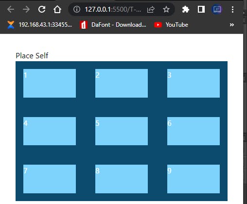 Screenshot of place self auto in Tailwind CSS
Note that the place-items property on the container takes a value of stretch and the place-self-auto align itself based on the value of the place-items property.
So the place-self-auto depends on the value we assign to the place-items property.
place-self-stretch: Use to justify and align a particular item to stretch and fit on both axes irrespective of the value set to the place-items property
Type and run the code below.
<div class="mt-8 ml-8 mr-8">
        <p>Place Self</p>
        <div class="h-72 grid grid-cols-3 gap-2 bg-sky-900 place-items-start">
            <div class="m-4 bg-sky-300 text-white">1</div>
            <div class="m-4 bg-sky-300 text-white">2</div>
            <div class="m-4 bg-sky-300 text-white">3</div>
            <div class="m-4 bg-sky-300 text-white place-self-stretch">4</div>
            <div class="m-4 bg-sky-300 text-white">5</div>
            <div class="m-4 bg-sky-300 text-white">6</div>
            <div class="m-4 bg-sky-300 text-white">7</div>
            <div class="m-4 bg-sky-300 text-white">8</div>
            <div class="m-4 bg-sky-300 text-white">9</div>
        </div>
Browser Output.
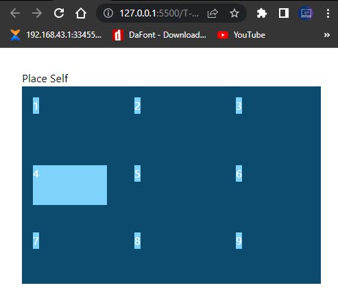 Screenshot of place self stretch in Tailwind CSS
From the code sample above, you’ll notice that we set the place-items property to a value of place-items-start and place-self-stretch to the fourth div tag of our elements.
As a result, other elements are stacked to the start while the fourth div tag is stretched.
CONCLUTION:
Congratulations for taking your time to read this blog post to the end. By now you should understand the following topics that we’ve discussed so far.
- How to install and work Tailwind CSS using the CLI tools and play CDN.
- Typography
- Sizing, here we talked width and height
- Arbitrary Values
- Spacing, where we talked about margin and padding
- Flexbox
- The Grid System.
WHAT NEXT?
On our next blog post. which is going to be a continuation (part 2) of the same series of GETTING STARTED WITH TAILWIND CSS FROM A BEGINNER’S PROSPECTIVE (PART 1).
We be building a project using Tailwind CSS Titled “How to build a gym landing page using Tailwind CSS (Part 2)”.
So keep your fingers crossed.
Thanks once again for reading.