
NavLink Component in React Router
A Complete guide to NavLink Component in React Router


Introduction
The <NavLink> component in React-Router is used for navigating to different components within a single page application. This is very useful when creating a navbar component in your React app. The <NavLink> component does the same thing as the <Link> component but provides additional features like styling props that enable developers to add an active state.
This helps users to visually know which part of the navbar is clicked and what part of the page they are currently in.
In this blog post, I explained what <NavLink> do, how to add active class to navbar components and also how to work with other props that come with the <NavLink> components.
Prerequisite
To follow along, you should have a basic understanding of the following.
How to set up a React App
How to install React Router
NavLink
The <NavLink> component in React Router is used for navigation. The <NavLink> renders as <a> tag when loaded on the DOM.
This is very useful for linking pages that require an active state for example navbar, breadcrumbs, and list items with active class that shows which item is currently selected.
To apply <NavLink> import it form the react-dom-dom like so 👇
import { NavLink } from "react-router-dom";
The <NavLink> is an opening and closing tag, so text content should be applied followed by the closing tag.
<li>
    <NavLink to="/">Home</NavLink>
</li>
Props
The <NavLink> components come with props (properties), these props can be used to style the <NavLink> component which determines how NavLink is rendered on the page. These include
to
active (can be specified but exist by default)
style
className
children
end
caseSensitive
aria-current
reloadDocument
to
The to prop sets the path or route that should display when the link is clicked.
import { NavLink } from "react-router-dom";

                    <ul>
            <li>
              <NavLink to="/">Home</NavLink>
            </li>
            <li>
              <NavLink to="service">Services</NavLink>
            </li>
            <li>
              <NavLink to="about">About</NavLink>
            </li>
          </ul>
The to is equivalent to the href in the <a>. This means that when the to prop renders on the DOM it returns a href attribute.
active
The <NavLink> component by default has an active class which can be styled to indicate which component or page is active.
import { NavLink } from "react-router-dom";

        <ul>
            <li>
              <NavLink to="/">Home</NavLink>
            </li>
            <li>
              <NavLink to="service">Services</NavLink>
            </li>
            <li>
              <NavLink to="about">About</NavLink>
            </li>
         </ul>
Unlike most props, the active class is Not specified directly on the <NavLink> component but it exists and can be styled as follows.
.navbar ul a.active {
  color: rgb(34 197 94);
}
See Codesandbox for a code sample.
style
The style prop in <NavLink> component works differently from another style prop in other components. It takes in two functions isActive and isPending as a parameter and can be destructured within JSX to specify what should happen to the element when it’s active or pending.
The style prop can be very useful in situations where you are not using CSS for styling but still want to apply styles on active state.
isActive
Example one
<NavLink
   to="/"
   style={({ isActive }) => {
       return isActive ? { color: "plum" } : {};
       }}
       >
     Home
</NavLink>
Here, isActive function is destructed with a callback function that returns an object with a color property of plum if isActive is true and otherwise return an empty object if it false.
See the code sample on Codesandbox.
Example two
You might want to specify your code at the top level of your component and then parse the return value to the <NavLink>. This can be very useful in situations where you want to pass in multiple style properties as objects and you don’t want to mess up your JSX syntax with convoluted code.
<NavLink to="/" style={activeState}> Home</NavLink>
See the code example on Codesandbox
isPending
The isPending function is used to set what style should apply to the link when a user clicks on it and the link is still in the navigating phase and is not yet complete.
It works like a promise, where you have a pending state before the promise is fulfilled.
Example four
<NavLink
   to="/"
   style={({ isPending }) => {
         return {
           color: isPending ? "yellow" : ""
         };
      }}
     >
   Home
</NavLink>
See the code example on Codesandbox
isActive and isPending
The isActive state and isPending state can both be specified in the same function.
const activeState = ({ isActive, isPending }) => {
    return {
      color: isPending ? "rgb(253 230 138)" : "",
      backgroundColor: isActive ? "rgb(69 26 3)" : "",
      fontWeight: isActive ? "bold" : ""
    };
  };
See the code example on Codesandbox
ClassName
The className prop does the same thing as the style prop but with class attributes.
<NavLink
    to="/"
    className={({ isActive }) => {
       return isActive ? "active" : "";
    }}
      >
    Home
</NavLink>
See the code example on Codesandbox
tailwind classes
The className prop can be very useful in a tailwind application when you need to apply an active state to a link element component.
<NavLink
    to="/"
       className={({ isActive }) => {
          return isActive ? "text-orange-500" : "text-white";
         }}
       >
        Home
   </NavLink>
See the code example on Codesandbox
children
The children prop is not a prop but a way of parsing JSX functions as children that conditionally returns an element as direct children when the <NavLink> is active.
<NavLink to="/">
    {({ isActive }) => {
         return isActive ? (
         <span className="">Home</span>
          ) : (
          <span className="">Page</span>
         );
       }}
  </NavLink>
See the code example on Codesandbox
Example two
There are cases where you might want to display a text or an emoji alongside the text on the <NavLink> when it's active. This can be done using the method below.
<NavLink
    to="about"
    style={({ isActive }) => {
        return isActive ? { color: "plum" } : {};
      }}
     >
       {({ isActive }) => {
         return isActive ? "💁 About" : "About";
      }}
 </NavLink>
See the code example on Codesandbox
end
The end prop is used to indicate the route where the active or pending state should stop. It prevents the children from inheriting the active state from the parent <NavLink>.
<NavLink
   to="service"
   end
   style={({ isActive }) => {
       return isActive ? { color: "plum" } : {};
   }}
     >
  Services
</NavLink>
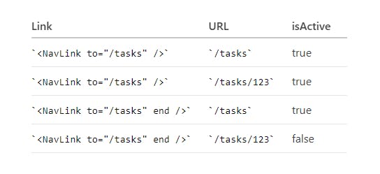
Image Creadit React Reouter Docs
caseSensitive
By default react router matches any path or route specified in the to prop regardless of Its case. To change this behaviour and make it match based on the case parsed to the to prop the caseSensitive prop is used.
This means that about and About are not going to match because of differences in casing.
<NavLink
    to="serVicE"
    caseSensitive
    style={({ isActive }) => {
        return isActive ? { color: "plum" } : {};
           }}
    >
     Services
</NavLink>

Image Creadit React Reouter Docs
aria-current
The aria-current prop is used to set the aria-current on the active element.
<NavLink
   to="serVicE"
   aria-current="page"
   style={({ isActive }) => {
         return isActive ? { color: "plum" } : {};
          }}
      >
      Services
  </NavLink>
reloadDocument
The reloadDocument prop is used to set the <NavLink> component back to the default behaviour by preventing client-side routing. This will enable the page to reload anytime the link is clicked.
<NavLink
  to="serVicE"
  reloadDocument
  style={({ isActive }) => {
  return isActive ? { color: "coral" } : {};
      }}
  >
    Services
</NavLink>
See the code example on Codesandbox
Parsing Attribute on the NavLink Component
Aside the default props, the <NavLink> can accept HTML attribute same as the <a> tag.
<NavLink className="card" key={item.id} to={item.src} target="_blank">text</NavLink>
Conclusion
The <NavLink> component in React Router makes it possible for client-side routing just like the <Link> component, they both share the properties and functions the same way. However, the <NavLink> component comes with some additional properties that make it easy for styling navigation menus and adding active or pending state to link element.
We can determine which part of the navigation menu a user is currently on when the isActive function is set on the <NavLink>